Drake Take: Relationship reignited between rapper, Kentucky Basketball

Photo by Dr. Michael Huang | Kentucky Sports Radio

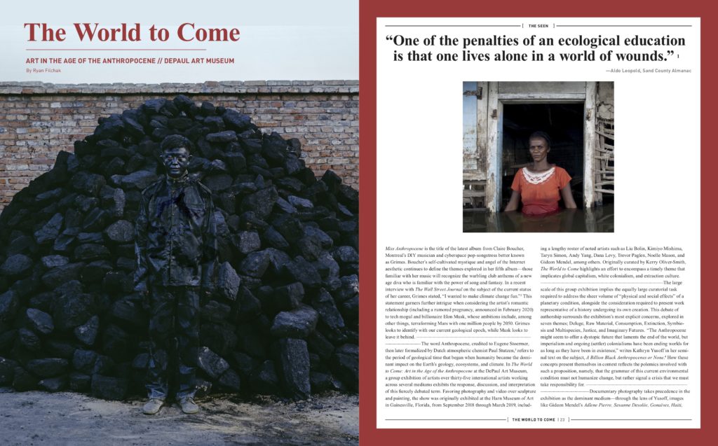
In 2014 Pitchfork declared the death of Drake’s career. The historically hard-to-please music review site made this proclamation not based on music, but the now infamously bad shot taken by Aubrey “Drake” Graham that year in the layup line at Big Blue Madness, where, decked out in team gear, the rapper airballed a long two in front of 20,000 fans and a large televised audience. Undoubtedly an embarrassing moment for the star, for those of us familiar with Kentucky Basketball, it was simply a bizarre distraction from the possibility of a perfect season, a Calipari recruiting tactic possibly gone too far. As we head into the 2023-24 regular, Drake’s connection to the program returns, and at the perfect time.  

Held in Drake’s home country of Canada, July’s GLOBL Jam Tournament had folks from off the Bert T. Combs Mountain Parkway to the furthest reach of the Jackson Purchase hotwiring cable boxes and teaching older generations yet again, “how to get the internet on the TV.” For those who figured it out, there was a lot to digest. Four games in five days provided ample discussion about the relief of Antonio Reeves’ return, the promise of Reed Shepherd’s future, the pain of Ugonna Onyenso’s foot injury, and the surprise of an unfamiliar shot chart, but three things happened in Canada that rang bells outside the Bluegrass state. In order of influence: 

  1. Drake gives Cal and Crew keys to his $100 Million mansion, including an NBA regulation-size basketball court. 
  2. GQ’s “NBA’s Most Stylish Player” Shai Gilgeous-Alexander sits courtside, speaks wisdom and praise to the current team roster in the locker room
  3. Lil Yachty posts his University of Kentucky-Themed Nike Nocta Glide Pre-Release pair before the sneakers see official release later this year on Instagram, tags Drake. Drake reposts. (Retail, $160)

None of these items reference a box score, but made headlines in and beyond the Big Blue Nation, giving the program an injection of clout and intrigue painfully absent the last few years. They also signaled the resurrection of the relationship between the program and the superstar. In short, when it comes to Cal and recruiting, ball finds the shooter. 

“Started out doin’ Colle Shows, Calipari Flow”

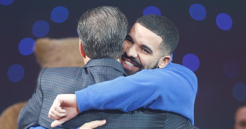
The bromance between Drake and John Calipari dates back to his inaugural season at Kentucky. In April 2010, Drake played Memorial Coliseum, introducing Calipari and the whole team mid-concert to the loudest cheers of the night. Playing it cool after this abrupt upstaging, he would later fly from Toronto to see Kentucky beat Wake Forest in the Sweet Sixteen. Two seasons later, still fanboying heavy for Calipari and his teams, Drake coached Anthony Davis in the 2012 Alumni game, and in a sign of mutual support, the program gifted him a championship ring after Kentucky won its eighth title in New Orleans, engraved “Drizzy.” 

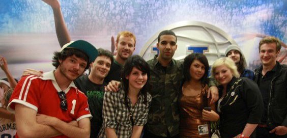
During the 2014-15 season, you had the Madness mishap, and during the 2015-16 season, things turned problematic with a level III NCAA violation for Tyler Ulis receiving preferential treatment via an invitation to a Drake after-party and taking a photo with the rapper. Relations cooled after this incident, but in 2017 Drake would pen the lyrics “Started out doin’ College Shows, Calipari Flow” for his song “Can’t Have Everything” off the album More Life, once again paying respect to the one who first invited him to share in the love and community of BBN. The photo of him in Kentucky’s locker room in uniform prior to 2014 Big Blue Madness still pops up on social media occasionally as a meme.

Like all great partnerships, the two have had their ups and downs, but when it comes to past infractions, they seem laughable in the light of the modern NIL era and the benefits for Calipari on the recruitment trail were too plentiful. No news is good news, and Drake’s love for all things UK remains on record and looks really, really great in print.

To read Complex magazine’s oral history of Drake’s shot heard ’round the world, the players on the court with him gave him a lot of grace for missing, citing their own misses, smoke from the pyrotechnics, and his general unfamiliarity with the event. However, simply his presence had a profound impact.

“We were very excited, not many other teams get the opportunity to get one of the best rappers of all time to come into their locker room. It’s great to have built a relationship with him since then as well,” said three-time NBA All-Star Devin Booker.

#LaFamilia is now Kentucky Basketball’s approach to NIL, presumably funded in part by the NBA salaries garnered by players like Booker, who watched The Six God airball firsthand. However, aside from sharp social media campaigns, we don’t know much about the financial logistics of this program, and probably never will. Much like most NIL transactions, no one holds the receipts but the players and the programs themselves, and everyone is incentivized to inflate their numbers.

Point in case, five-star recruit turned Wildcat DJ Wagner. Wagner made an appearance in an early promotional campaign for Drake’s Nike Sub-label NOCTA when he had yet to decide between UK and Louisville, tipping recruitment rumors in UK’s favor. I don’t need to know how much he made to know that the source of that income was the potential clincher in him rocking Kentucky blue.

NOCTA, shorthand for the “nocturnal creative process” of the label’s owner, first released minimalist outerwear inspired by the looks of Toronto, Paris, and New York, but has since expanded to incorporate a golf brand, and now most importantly to those still reading, a basketball collection. This is great news for Kentucky, a Nike school, and Cal, a Drake friend, as recruitment efforts (read: endorsements), can be offered straight from Drake’s growing empire of Nike-affiliated athletic wear and sneakers to future players. We have come a long way from UK players getting slapped on the wrist for taking a selfie.

Photo by Dr. Michael Huang | Kentucky Sports Radio

Will Drake return to Big Blue Madness?

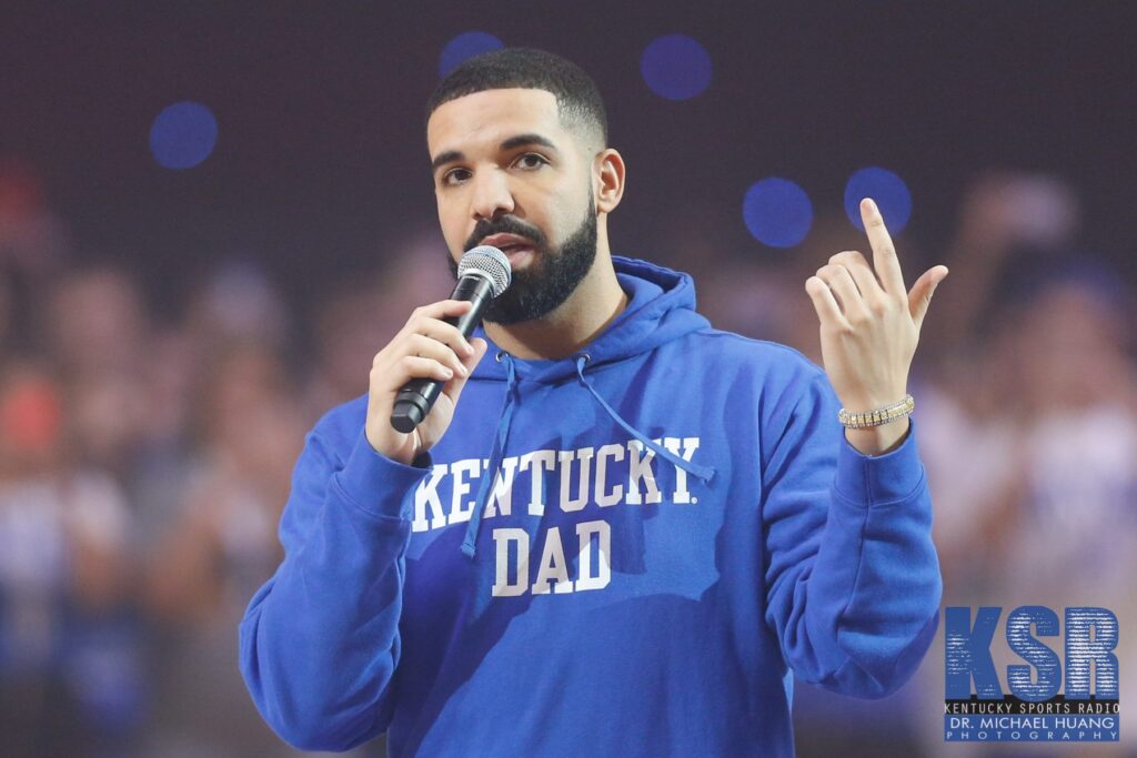
Drake is currently performing on his It’s All A Blur tour, selling out every major city in the contiguous 48 as well as his home court of Toronto. Coincidentally, his run of shows ends in early October, around the same time Kentucky typically schedules Big Blue Madness Whether or not Drake returns to Rupp Arena remains to be seen – remember that he still owes UK students a free concert. Even if you feel he all too eagerly volunteered his services to drive the bandwagon back in 2010 when things were good, or if you feel he truly embodies the “Kentucky Dad” hoodie he wore in Rupp Arena circa 2017, his relevance in the zeitgeist has never been larger, while Kentucky’s noteworthy contributions to college basketball have waned in the last few years.

What began as a fast and loose, soft power recruitment technique from Calipari now spans 13 years of seemingly genuine friendship and mentorship, and their partnership has evolved into a tangible recruiting pipeline for Kentucky in this new NIL era.  Drake’s ability to endorse players Cal is trying to recruit, pulls all the lyrical references, event invites, and public appearances into an explicit business transaction where players, teams and Nike can all share in the success of each other.

When we get back to the second weekend of the NCAA tournament, we can feel sorry for the airball by a young musician in our hallowed halls, but until we’re back hanging banners with regularity, we might want to ask Drake if he wants to suit back up.


Photo submitted by Ryan Filchak (far left)

Ryan Filchak is a writer from Versailles, Ky who enjoys crispy but not too crispy chicken wings, cheap lagers from around the world, and the Southern gothic short stories of Flannery O’Connor. He is the host of “Bumper to Bumper” on Beloved Radio in Chicago, an homage and evolution of his parents’ former call-in car talk show on WLAP by the same name. You can follow him on Instagram (@ryanfilchak), the radio (Bumper to Bumper), or his website, ryanfilchak.com.

Breakout Artists 2021: Chicago’s Next Generation of Image Makers

Nat Pyper/Photo: Ang Zheng

Nat Pyper

“I use language as a sieve, and I push the body through it,” says Nat Pyper, a 2018 MFA graduate of Yale School of Art. “Publishing is a way to make kin across time and space.” A self-described “alphabet artist,” Pyper employs science fiction, wearable text, video performance and font design to work toward this goal, using publishing as praxis and literacy as a tool for liberation. Combined with their background in design and a healthy obsession with queer, anarchist publishing histories, Pyper’s work mines the past to service the navigation of identity in the present, while testing the application, form and limits of language.

Nat Pyper, “Together They Ask,” 2020

Pyper’s video, “Get Ups for the Get Down,” shown at Vox Populi at the end of 2019, features a group of dancers at a discotheque wearing two-piece felt garments of the artist’s design; each piece of clothing features snippets of language, also chosen by the artist. As music plays, and the camera cuts between dancers, the viewer glimpses the phrases written on the wearables: “Direct Action,” “In Chaotic Unison” and “In the Club.” By blending performance and text, Pyper presents a nightlife utopia achieved through literal and suggestive messaging, through discourse and dance.

Not beholden to fiction or a fixed studio practice, Pyper’s writing references the printed archives of countercultural scenes of the late eighties and early nineties. Not content to eulogize, Pyper acts as an archaeologist. “When I was researching, there was no definitive map of queer zine history,” Pyper says. “This work does not want to be historicized and I am interested in reinvigorating and recontextualizing this material. Queerness exists outside of reproduction and inheritance. To map this history is to create a new lineage.”

In their contributing essay for the “Hardcore Fan-zine; Good and Plenty 1889-1992” collection reprint, published by Draw Down Books, Pyper writes about how “IN TOUCH,” a softcore gay porn magazine, described to their readers the sensation of body-to-body contact experienced in the pit of a punk show. Alongside photos of Henry Rollins, Jello Biafra and Iggy Pop, the male-dominated and aggressive punk scene of the time is cast in a new light from this explicit editorial angle, and one wonders how this genre of music could present as anything other than virile and sexual and deeply homoerotic.

Nat Pyper, “A Queer Year of Love Letters,” 2021

This kind of language analysis within a countercultural context contains a functional application when it comes to Pyper’s typography project, “Queer Year of Love Letters.” Published by Library Stack, Pyper uses primary source materials from anarchist, socialist and queer groups dating back to the postwar era to design a series of fonts that reference these histories. An example of this work was in an exhibition at Pyper’s undergraduate alma mater, for the Milwaukee Institute of Art & Design alumni invitational exhibition, “Vision and Voice.”

“I Take the Sign With Me,” 2018

Pyper released part III of “19 in 2021” during this February’s Printed Matter’s Virtual Art Book Fair. An ongoing science-fiction serial about four Latinx friends navigating an all-too-possible future landscape of late capitalism, the narrative channels literary heroes like Samuel R. Delany and Ursula K. Le Guin. “These people are using genre as a tool, and this gets me excited, sci-fi that is rooted in poetics rather than politics,” Pyper says.

When asked about plans for the future, the 2021-2022 HATCH artist resident at the Chicago Artists Coalition says they look to synthesize their research and writing into more video and object-based art-making, “My interest in video and language is based in my interest of an ephemeral practice. I go back to these aspatial and atemporal kinships because of the way they allow me to read, write and rewrite the world.”

Cruising the Farmhouse: Aaron Skolnick’s Between Two Suns

Aaron Skolnick, Between Two Suns, 2020, installation view. Images by Alan Rideout and courtesy of MARCH.

Although it contains multiple points of interest, Aaron Skolnick’s recent exhibition Between Two Suns warrants attention for the unorthodox method of its presentation alone: installed in an abandoned farmhouse in Taylor County, Kentucky, Skolnick’s paintings are only viewable online on the website for MARCH, a new gallery launched by Institute 193 founder and curator-at-large Phillip March Jones.  Aside from Jones, who placed the work, and photographer Alan Rideout, who documented its installation, no one actually saw this exhibition outside of installation images. There were no public viewing hours and no in-person appointments. Only by visiting the gallery website can you view Skolnick’s portraits and landscapes installed amid the lush, overgrown fields of the rural South, inside a modest farm dwelling, above the door of a long neglected tobacco barn, and elsewhere, each subject glowing with a ghostly, calm aura.

Among these familiarly folksy backdrops, Skolnick’s sexually explicit portraits of men provide the subject material for the majority of the work; moonscapes, flowers and butterflies occupy the rest. Influenced by the photography of Alvin Baltrop, Skolnick’s subjects occupy the spaces of a queer male cruising scene. In an interview with University of Kentucky Art Museum director Stuart Horodner for the publication GAYLETTER, Skolnick described his subjects: “I wanted to depict men in a mode of relaxation, okay with waiting, being happy to be in a place of momentary safety and nirvana.” Unlike Baltrop, who documented the urban cruising scene of Manhattan’s West Side piers, the environments and subjects painted for Between Two Suns reference the cruising spots of  Hudson, New York—where he lived between 2018 and 2020—and the Kentucky landscape of Skolnick’s youth. 

Aaron Skolnick, Untitled, 2020; watercolor on paper.

When I spoke to Skolnick about the series of work, I first asked about color: why paint in such hazy blues and glowing warm tones? “I wanted the paint to be immediate,” he said. “I did this to teach myself to paint by limiting the palette.” Prior to this series, Skolnick’s work focused on photorealistic graphite drawings and optical paintings, typically sourced from historical images of the 1960s civil rights movement. In these diaristic portraits of fictional characters based in the reality of cruising, the shifts in Skolnick’s chosen medium, style, and voyeuristic approach all mark recent developments and tremendous growth.

What is not new to Skolnick’s practice are the multiple layers of meaning contained within the works. His methods of painting aside, Skolnick references queer history, Southern politics, and exhibition logistics simultaneously. As we discussed color, our conversation turned to the work of James Turell. Skolnick compared his emotions while experiencing Turell’s work to the primal sensations of the hunter and the hunted—the same dynamics involved in many anonymous sexual pursuits. Ironically, none of the images in this series contain explicitly erotic scenes, nor does any one paining contain more than one subject. Either painted from the waist up or the waist down, Skolnick dignifies and praises the body language of intimate uncertainty. Through his eyes, these men are sheltered, impervious from threat or harm.

With Between Two Suns, the symbols of domestic life carry the weight of Skolnick’s self-made alternate reality. Nude male portraits hang from the bedroom wall, but also above the hearth, in the kitchen, outside in a field. By making space for queer sexual exploration in the historically hostile rural environment, the mere presence of these images becomes radically affirming.

Photographer Tag Christof wrote the text that accompanies Between Two Suns, wherein he further contextualizes the history of cruising and expresses disdain for apps such as Grindr and Scruff, which have become the operative technologies for men seeking sex with each other. This transition from a physical setting—whether urban or rural—to a virtual one portends a bleak future for Christof. Not only do dating apps remove the body language Skolnick’s paintings eloquently express, they remove the idiosyncrasies of humanity almost entirely. A grid of images sorted by algorithms fails to offer what Christof describes as a “dance of nuance,” the interpretive exchange that characterizes cruising.

Aaron Skolnick, Between Two Suns, 2020, installation view. Images by Alan Rideout and courtesy of MARCH.

In his essay “Making Meaning,” published earlier this year in Harper’s,  Garth Greenwell argues against “relevancy” in the arts and critiques the flaws inherent in our modern algorithm-driven life, concerns and fears shared by Christof and Skolnick. He writes,

“It’s as though we want to engineer an encounter with art the way we might engineer an encounter on a dating app, filtering by attributes we’re sure we want in a partner: a certain age or height or race. My problem with those apps is not just that swiping left is always a degraded response to another person, but also that we never know as much about our own desires as we think we do. One of the great gifts and challenges of desire is that it illuminates who we are in unexpected ways.”

An irony emerges here, however: Between Two Suns is accessible exclusively through digital images, mirroring the transition from the physical to digital decried by Christof. The exhibition and its unique presentation contain layers of potential inquiry, but a pervasive vulnerability grounds the paintings’ themes of public sex, gay identity, and queer futurity. When it comes to the act of cruising, Skolnick asks himself, How do you participate when the painter is the ultimate voyeur? 


Aaron Skolnick’s exhibition Between Two Suns was presented online by MARCH from October 19 through December 1, 2020.


[1] Stuart Horodner, “Aaron Skolnick,”GAYLETTER, October 26, 2020.
[2] Garth Greenwell, “Making Meaning,”Harper’s Magazine, October 15, 2020.

Theresa Escobedo Expresses a Pervasive Anarcho-Punk Ethos in Her Cross-Genre Practice

Photo by Jesse Bryant

Theresa Escobedo’s illustrations pull subject matter from fantasy novels, skate culture and folk art to make cross-genre collage and designs. This fluidity in style and material supports a pervasive anarcho-punk ethos common throughout the work. For one such design, a black knight grips the handle of a sword pointed towards the ground; flowers vine up the blade, and it’s framed within a decorative border. The screen printed handkerchief reads, “the path to paradise begins in hell.” Whether for a unique piece, or a limited run of t-shirts, Escobedo continues to sharpen a visual identity that evolves and expands from one medium to another. Her work is never without warmth, and although the skies above the castle may storm, the promise of shelter compels us to cross the drawbridge.

Theresa and I met in Chicago’s Humboldt Park on the 29th of May. Coffee shops, bars and restaurants are closed. Public parks remain open during shelter-in-residence. We sat on rocks by the pond, talked about the city and watched geese swim circles in the water. What follows is a loose transcription of that conversation. 

Photo by Jesse Bryant

You grew up in San Antonio, and lived in Austin, TX for a spell. How did you find yourself in Chicago? Were you looking for a drastic change in weather, or did something specific bring you here?

Definitely wouldn’t say weather, although I mostly don’t mind it now. Funny enough, the day I moved here, was the first time I had ever been to Chicago. I spent most of my twenties jumping cities. Austin, NYC, St. Louis. I ended up in Chicago after my friends offered a cheap basement room, with seven roommates, no windows, and I figured. . .  that was my green light. I fell in love with Chicago immediately though, and quickly settled up and out of the basement. I feel very lucky to have the friends and community I have here. It’s been a little over two years, and I haven’t had any intention of leaving. 

How did your relationship with illustration begin?

As a kid I occupied a lot of my time with drawing and crafts. Certainly, made a lot of teen-angst bedroom art. I became more consistent, right after high school. I was drawing a lot of flyers for punk shows that I either booked or played. 

Photo by Jesse Bryant

I can see the influence of punk iconography and graphics in your drawings, and you always keep a bold quality to the line. Is this something you strive to maintain in your work?

In my early days of drawing, my interest in tattoos grew, maybe obsessively. I’m pretty sure from 2010 – 2015 I almost solely drew tattoo flash. Completely with the intention of tattooing one day. That’s definitely where the bold outlines originate. The idea was, if I just kept getting tattooed, and putting my flash out there, an apprenticeship would appear. But it never happened, and honesty I’m grateful it didn’t. During those years I was so focused on getting into a shop. I can really see now how I’d struggle with the constraints of a traditional tattooing path. 

I’m still obsessed with tattoos, and the craft, of course.  And I think the influence of tattoo flash is still pretty visible in most of my illustrations. But I think by relieving the idea of a traditional tattoo career, I was able to recognize that approach wasn’t working for me. 

Did changing environments have any significant impact to your process after making this realization?

I’d like to think with all of the moving in recent years I’ve become pretty adaptable. I do prefer to maintain routines though. Drawing is such an isolating practice it is easy to quite literally get stuck in one place, or mindset, for a long time. And I am heavily influenced by my environment. 

I was able to take drawing with me as I figured out where I wanted to be. But now that I’ve settled here in Chicago, I’ve been attempting more involved and large scale projects. I’m trying to explore new methods that evolve naturally. Just slow down a ton. I’ve had a long M.O. of never completing anything after a couple days. So, I’m learning to love the long processes now. More painting, printing, and recently paper mache. 

Photo by Jesse Bryant

You mentioned exploring new mediums; beyond painting and printing, you also use a range of mediums with particular devotion to Mexican Traditionalism. Can you speak on that a little in regards to your latest project?

While in quarantine, I really needed a break from drawing. I was already feeling a bit of burn out, and was searching for more meditative practices outside of art making. I started experimenting with paper mache as a hobbyist, and it’s transformed into a pretty unpredicted introspection.

Identifying as Chicana is important to me. I often use different traditional Latinx mediums and concepts. Ballpoint pen, paper mache, also themes and symbolisms. But as a white, non-Spanish speaking, Mexican-American, I’ve battled with exhibiting that identity in my work. I try and observe my own cultural connection and authenticity, while engaging with my privilege. Which is totally awkward and uncomfortable, but also feels really good. 

Photo by Jesse Bryant

I’ve recently been focused on a series of traditional paper mache masks. A series with no real, structured direction, but an opportunity for self-examination and education.  I hope to release a small photo book of the project later this year. 

Is there one memory that sticks out to you? Maybe a jumping off point when you realized you wanted to make art?

I guess, in all honesty, I watched a lot of TV as a kid, a lot of cartoons. I remember thinking pretty young, it’d be badass to make a cartoon show. Still think so. 

For more from Theresa Escobedo, follow her on Instagram.

Photography by Jesse Bryant.

Case Mahan Has Us “Smothered, Covered” In The New EP From His Band, Daniel Case

Photo by Coleman Guyon

For those unfamiliar, the Southern restaurant chain Waffle House serves their hash browns smothered, covered, chunked, diced, peppered, capped, topped and country. These modifiers each represent an ingredient one can add to the dish; covered is melted cheese, smothered is sautéed onions, topped is Bert’s chili, etc. Order “All the Way” and you get the full list of toppings at a discounted price.

Case Mahan, Kentucky musician and bandleader of Daniel Case, kicks off his latest EP Freeway with a song called “Smothered, Covered,” a literal reference to Waffle House breakfast. On the opening track Mahan lends a subtle and lilting mountain drawl, while the fiddle work roots us in place and the plodding drums remind us it’s a while yet till closing time. Freeway covers ground, and not just amongst the tightly packed album itself. Having last recorded under the stage name Street Gnar, releasing records with Atelier Ciseaux, River Girls and Burger Records, the Daniel Case band marks a renewal of resources and perspective; a homecoming. I recently spoke with Mahan about this new direction in his music, how he pulled these pieces together, and the people and places that raised him. 

Photo by Coleman Guyon

Prior to this record, you have primarily recorded under the solo moniker Street Gnar. Can you tell me in what ways this EP release differs from that body of work?

I don’t think it’s unfair to compare the two. I think the main contrast would be that this EP was really a collaborative effort with my bandmates even though it is under my own name, ironically. Though I wrote the songs, we worked them out together over the past year by playing gigs around Lexington.  

In 2014 you recorded your last Street Gnar album, Blue Healer, in Atlanta, Georgia with Cyrus Shamir of the N.E.C. Did you record “Freeway” in the same way?

For this go around we stayed in Lexington and recorded with Otto Helmuth. We hit it off right away and worked really fast. In the past, I had only really written and improvised during the recording process, so showing up with the entire band ready to go, everything written, was a change in process for me. Almost too cliche to even mention, but cutting songs live with the band in the same room creates a completely new energy for the songs for sure. 

Can you tell me who all contributed to this record?

Josh Blaine (Jovontaes) plays drums. Luke Ritchey (The Dolphins) bass and vocals. Sam McWilliams (Bear Medicine) plays fiddle. James Friley (Idiot Glee) keys. Warren Byrom and Josh Wright (Bear Medicine) singing harmonies. And I play the guitar and sing.

Photo by Coleman Guyon

And the cover design, how did you wish to see this artwork incorporated into the project?

Lionell Guzman drew the cover almost ten years ago, I think. I love his simple drawings and he’s just the best at creating whimsical designs that convey cool esoteric feelings. The fallen horse was perfect.

“Freeway,” compared to the ethereal and dreamy bedroom-pop of your Street Gnar tapes, more directly references your personal geography of Appalachia and Central Kentucky as well as the traditional sound of the region; fiddles on the mix, twang in the vocals. How conscious of this were you when writing this record?

I grew up taking mandolin lessons and playing bluegrass songs in Eastern Kentucky when I was young, so the fundamental twang isn’t too foreign to me. That being said, I lost interest in it for some years and didn’t even get into traditional “country” music until I was probably 27. I’ve settled down in Lexington the past few years after traveling, touring, and basically completely raging all the way through my 20s.

It was fun to make a record that tips the hat to Kentucky’s yesteryear heroes like J.D. Crowe and The New South. I was listening to them, Keith Whitley, Dwight Yoakam, Jim Ford, etc. Similarly, I wanted to make the project a “front man” style band. Choosing to use traditional instruments came naturally because that’s what we were listening to. I met Sam (our fiddle player) during a different recording session because the song was begging for fiddle. The engineer called him up and we’ve been playing every gig together since. He’s the best!

This project symbolizes growth for you artistically, sonically and personally. Did you make this record with those intentions, or did this progression occur more organically than I am implying?

Thank you. That is a huge compliment! I spent so much time trying to find a place to land after not publicly releasing music for over five years. So much can happen in that timeI can’t say it was completely calculated to end up where we did sonically, but the intentions were pure!

For more Daniel Case, follow @danielcasem on Instagram. 

Photography by Coleman Guyon.

Breakout Artists 2020: Chicago’s Next Generation of Image Makers

The artist in his Rogers Park studio/ Photo: Hyun Jung Jun

Cody Tumblin

Mixed-media artist Cody Tumblin received an invitation in 2017 to exhibit his paintings at a space in Nashville called Mild Climate. Feeling disheartened by his studio practice and the political climate, Tumblin decided not to hang work on the walls. but to instead host a community potluck in the gallery on opening night. Titled “Today’s Special,” the exhibition focused on food-based programming. Every other week Tumblin would install his microwave in the gallery and invite people to bring their leftovers, heat up food and share with others. The independent publisher Extended Play Press would print “Today’s Special Volume One,” a cookbook curated by Tumblin that scrapbooks the recipe swaps and culinary contributions made during these events.

“Blue Eyed Stranger,” oil and acrylic on muslin, zipper, dyed cotton, thread, 11 x 14 inches, 2019

For a culinary enthusiast who received his BFA in 2013 from the School of the Art Institute of Chicago, exercises like these reflect the hospitality and humility that Tumblin infuses into his visual practice. “The act of making paintings, for me, is very personal and very intimate—reflection, searching, excavating, finding hope. Because of this, painting doesn’t always feel outwardly generous,” he says. “I am constantly looking for ways to build a kind of giving into my work.”

Tumblin’s paintings intentionally avoid direct aesthetic associations, instead favoring recycling and reuse. He was originally a fashion design student at SAIC, and each piece has a base material make-up of fabric, dyes and thread. Works evolve from these foundational elements through collage, where Tumblin brings bits and pieces from his studio together to reflect an accumulation of time; layered raindrops and moons shift on the canvas, but never settle. This process of repetition and reworking combines with the aforementioned goal of making paintings with a built-in social engine; stitching scraps of fabric into the canvas, painting into the dyes, snipping threads. All these small acts add up to convey the larger themes of loss, growth and joy Tumblin wishes to express.

Ok Now We’re Dreaming,” dyed cotton, bleach, photograph of the sun on cotton, acrylic, dye, thread, 50 x 64 inches, 2017-2018

The themes that speak so loudly to the possibilities of being an artist for Tumblin saw their latest maturation in his 2019 exhibition “Stray Light Shadow Between” at Devening Projects. The press release described the way Tumblin makes a painting as “similar to making a soup.” Photographs of the sun printed on cotton were stitched into the middle of some of the paintings to serve as a conceptual and literal starting point. The repetition, or as Cody puts it, “the regurgitation” of form seen in both singular works and in the multiple pieces throughout this solo presentation emphasizes the importance of memory, which serves an alchemical purpose in the studio: to reference the past and inform the future.

“Warm in the Veins,” dyed cotton, photograph on cotton, acrylic and thread, 32 x 40 inches, 2018

Tumblin is scheduled to present a new body of work in October at H.G. Inn in Chicago. One can imagine that familiar shapes and colors, possibly even certain pieces of hand-dyed fabric, will harken back to that which preceded it.

The World to Come: Art in the Age of the Anthropocene // DePaul Art Museum

“One of the penalties of an ecological education is that one lives alone in a world of wounds.”

—Aldo Leopold, Sand County Almanac1
Richard Mosse, Stalemate, 2011. Digital chromogenic print. Courtesy of the artist and Jack Shainman Gallery, New York.

Miss Anthropocene is the title of the latest album from Claire Boucher, Montreal’s DIY musician and cyberspace pop-songstress better known as Grimes. Boucher’s self-cultivated mystique and angel of the Internet aesthetic continues to define the themes explored in her fifth album—those familiar with her music will recognize the warbling club anthems of a new age diva who is familiar with the power of song and fantasy. In a recent interview with The Wall Street Journal on the subject of the current status of her career, Grimes stated, “I wanted to make climate change fun.”2 This statement garners further intrigue when considering the artist’s romantic relationship (including a rumored pregnancy, announced in February 2020) to tech mogul and billionaire Elon Musk, whose ambitions include, among other things, terraforming Mars with one million people by 2050. Grimes looks to identify with our current geological epoch, while Musk looks to leave it behind.

The word Anthropocene, credited to Eugene Stoermer, then later formalized by Dutch atmospheric chemist Paul Stutzen,3 refers to the period of geological time that began when humanity became the domi-nant impact on the Earth’s geology, ecosystems, and climate. In The World to Come: Art in the Age of the Anthropocene at the DePaul Art Museum, a group exhibition of artists over thirty-five international artists working across several mediums exhibits the response, discussion, and interpretation of this fiercely debated term. Favoring photography and video over sculpture and painting, the show was originally exhibited at the Harn Museum of Art in Gainesville, Florida, from September 2018 through March 2019, including a lengthy roster of noted artists such as Liu Bolin, Kimiyo Mishima, Taryn Simon, Andy Yang, Dana Levy, Trevor Paglen, Noelle Mason, and Gideon Mendel, among others. Originally curated by Kerry Oliver-Smith, The World to Come highlights an effort to encompass a timely theme that implicates global capitalism, white colonialism, and extraction culture.

Liu Bolin, Hiding in the City, No. 95, CoalPile, 2010. Chromogenic print. © Liu Bolin. Loan courtesy of Eli Klein. Image courtesy of Eli Klein and the artist.

The large scale of this group exhibition implies the equally large curatorial task required to address the sheer volume of “physical and social effects” of a planetary condition, alongside the consideration required to present work representative of a history undergoing its own creation. This debate of authorship surrounds the exhibition’s most explicit concerns, explored in seven themes; Deluge, Raw Material, Consumption, Extinction, Symbiosis and Multispecies, Justice, and Imaginary Futures. “The Anthropocene might seem to offer a dystopic future that laments the end of the world, but imperialism and ongoing (settler) colonialisms have been ending worlds for as long as they have been in existence,” writes Kathryn Yusoff in her seminal text on the subject, A Billion Black Anthropocenes or None.4 How these concepts present themselves in context reflects the polemics involved with such a proposition, namely, that the grammar of this current environmental condition must not humanize change, but rather signal a crisis that we must take responsibility for.

Documentary photography takes precedence in the exhibition as the dominant medium—through the lens of Yusoff, images like Gideon Mendel’s Adlene Pierre, Savanne Desolée, Gonaïves, Haiti, September 2008 (2008) achieve a complicated duality of meaning. Taken from Mendel’s Drowning World series, we see a Haitian woman, framed in the center of the photograph, standing in a doorway, staring into the camera, with flood waters reaching up past her waist. Mendel’s activist intentions show clearly the devastation on the subject’s home that stem from natural disaster, but by including this particular woman, in this particular country, Mendel invokes the requisite history of black culture and aesthetics often overlooked in the discourse of the Anthropocene.

Gideon Mendel, Adlene Pierre, Savanne Desolée, Gonaïves, Haiti, September 2008, from the series Drowning World, 2008. Chromogenic print. Courtesy of the artist and Axis Gallery, New York and New Jersey.

“If the Anthropocene is viewed as a resurrection of the impulse to reestablish humanism in all its exclusionary terms of universality, then any critical theory that does not work with and alongside black and indigenous studies will fail to deliver any epochal shift at all,” says Yusoff.5

Other works of photography on display include Richard Mosse’s Stalemate (2011) and Taryn Simon’s White Tiger (Kenny), Selective Inbreeding, Turpentine Creek Wildlife Refuge and Foundation, Eureka Springs, Arkansas (2007) provide further striking images for the exhibition, in part due to the use of a similar photographic style to Mendel. In each piece, nature takes dynamic precedence over the subject of humanity, portrayed as the aggressor towards machinery and as a caged animal, respectively. The absence of a human figure in each image does not dismiss a human involvement or complicity. In the instance of Chinese artist Liu Bolin’s self-portraits, the artist literally hides his own figure amongst natural resources and cityscapes in order to claim social and political statements. Hiding in the City, No. 95, Coal Pile (2010) uses Bolin’s act of identity forming to reinforce the unavoidable connection between body and earth, and the choices made both by him and for him in connection to fossil fuel extraction and use.

The exhibition does well to make this statement clear: humanity and earth are inextricably intertwined. Yet in addition to this perspective, other works reach further into the recesses of the current political stratosphere. For example, under the exhibition’s subheading, Imaginary Futures, artist Noelle Mason address technology and surveillance in relation to the Anthropocene. The exhibition’s title The World to Come invokes irony when considering the cross-stitched pieces from Mason’s series X-Ray Vision vs. Invisibility (2011–12), where digital images sourced from the US-Mexico border are remade by hand into material objects. The work tells the story of an all too brutal present, as well as an abstract invocation of past histories of human trafficking. Mason’s narratives of the undocumented immigrant do less to acknowledge the individual, in place speaking to the geo-political systems that are in place to govern border maintenance and surveillance—intrinsic elements of the Anthropocene.

Taryn Simon White Tiger (Kenny), Selective Inbreeding, Turpentine Creek Wildlife Refuge and Foundation, Eureka Springs, Arkansas, 2007.

In our current moment of historic and radical definition, The World to Come works to highlight artists like Andrew Yang, whose video work Interviews with the Milky Way (2016) explores the Anthropocene on an all-encompassing astro-logical scale. The two-channel video plays audio interviews conducted by Yang atop moving images of space; one interview is with his mother Ellen S. Yang, a child psychologist, and the other with his friend Jeff Oishi, a professor of astrophysics. In the work, the artist asks questions to people in his life, leveling topics such as breastfeeding with the celestial phenomenon of the Big Bang. This exhibition, ambitious in scale and scope, looks to achieve a similar understanding —by pulling material from both the largest and smallest moments of human history, only then can a clearer definition of the current geological era take shape.


The World to Come: Art in The Age of the Anthropocene at the DePaul Art Museum runs through August 16, 2020.

Doubling in the Dark: A Review of Morgan Mandalay at Extase

At Extase, an apartment gallery in Ukrainian Village, six paintings hang in an otherwise unfurnished front bedroom, where artist Morgan Mandalay uses a primarily drab color palette with pops of yellow and fire red to depict night skies, shrouded figures and dark interiors. In the recessed space of a would-be closet, Mandalay’s stunning “In the Garden of Heripedes” portrays a hunched figure dressed in straw hat and blue jeans as he walks with a tall cane through a moonlit lemon grove. A small creeping blaze burns in the bottom right corner of the piece, and as with several other pieces in the exhibition, the flames’ warm presence contradicts the mood of a twilight hour as they curiously pry themselves into the foreground, neither revealing their source nor their potential for growth.

Morgan Mandalay at Extase/Photo: Jesse Meredith and Extase Chicago

“On Colonus” marks the ninth exhibition for organizer Budgie Birka-White at Extase and the most recent body of work from the Chicago-based, California-born artist Mandalay. Through heavily implicative references to Sophocles’ play “Oedipus at Colonus,” and other distinct moments in classic literature and art history, this work provides the viewer with a complexity of subject matter and nuanced brushwork that has fallen out of favor in recent painting.

Small in scale, these quiet and tensile works by Mandalay shift from his previous musings on Paradise to a more subtle and personal world shaping, although “Forbidden Fruit” references Adam and Eve in the garden of Eden with the subtle substitution of lemon for apple. Best exemplified amongst Mandalay’s interior paintings are “Reflection Underground” and “Memory Palace,” in each piece a burning moon framed by the grid of a window pushes inward to light the room as the blacks, grays and navy blues counter the painting’s light source. And yet again, whether a candle inside the home, or a burning branch, the presence of a fire, cleansing and pure, remain a recurring theme with “On Colonus.” Through Mandalay’s process of doubling, he does well to reflect both his skills as a painter, and his ability to present the duality tied into the themes of memory and introspection represented on the canvas.

Morgan Mandalay at Extase/Photo: Jesse Meredith and Extase Chicago

For example, Adam and Eve may be the only explicit references to literature in this body of work, yet we do not see them in a moment of shame or atonement, but rather one of indecision; salvation and damnation exist side-by-side in this scene. “AUG 1961 in the Dark” features a hand nearing a light switch, but again, we know not whether this hand is reaching toward the switch, or pulling away. For Mandalay, this hand reaching into the space of the painting from the foreground sources the reaching arm silhouetted by a setting sun in the painting “The Raft of the Medusa,” by French Romantic painter Théodore Géricault. Pulling from this moment of desperation, where the raft’s passenger reaches toward a ship spotted on the horizon that will either save those left on the raft, or fade away, representing their last chance at survival, Mandalay pulls from the epic to express the infinitesimally personal.

“We do not dislike everything that shines, but we do prefer a pensive luster to a shallow brilliance, a murky light that, whether in a stone or artifact, bespeaks a sheen of antiquity.”

—Jun’ichiro Tanizaki, “In Praise of Shadows”

Surveillance Archeology: A Conversation with Robert Beatty

Installation view of Robert Beatty’s Place Holder at 21c Museum Hotels Lexington. (All images courtesy 21c Museum Hotels)

Robert Beatty’s illustrations often blend seemingly organic material with man-made technological artifacts: in one, a pink rotary phone spills wet and misshapen from a crack in the shell of an egg that is harnessed by leather and brass. In 2016, Floating World Comics published Floodgate Companion, a collection of Beatty’s sci-fi-flavored, psychedelic illustrations and album cover art. In lieu of text, Beatty often uses an indecipherable pictographic language whose visual style references a fictitious cosmic culture alongside earth’s own recent technological past. To view Beatty’s work is to view a history that is both familiar and foreign, simultaneously a present reality and the hypothetical ruins of a projected future.

A multidisciplinary artist living and working in Lexington, Kentucky, Beatty’s latest installation Place Holder marks a departure from his more widely known album covers, showing his uniquely crafted visual language applied to sculpture and video.

In the installation, small, gray concrete forms are arranged to build an abstract Brutalist model landscape reminiscent of ancient Mayan ruins. Surrounding these structures, three security cameras survey Beatty’s design and project the resulting video on the wall of the same room. The plinth used for Place Holder is not rectangular but instead angled, making the surface of the support smaller at the top than at the base. Beatty’s continued use of this rhombus shape in his work references the old-fashioned raised keys on a computer keyboard, a form that—in a matter of decades— has flattened, shrunk, and, in some cases, disappeared.

I recently spoke with Beatty about his approach to this installation, the elements of form and time contained in Place Holder, and how he sees this body of work evolving further still.

A spread from Beatty’s Floodgate Companion, 2016.

Ryan Filchak: 21c Lexington hosts public gallery viewing hours twenty-four-hours a day, seven days a week. Did the concept of this sort of constant access to Place Holder influence the design of the installation for you?

Robert Beatty: That wasn’t an explicit reason for doing the show at 21c, but I was definitely glad people had access to the work all times of the day and that they could often be the only person in the installation if they timed it right. In the initial plan for this exhibition I had wanted to livestream the camera feed on the internet for the duration of the exhibition, but that became a bit more complicated than I could manage in the time I had to organize everything.

RF: Do the added layers of projected security camera footage of concrete forms support this idea?

RB: A lot of the ideas that went into this piece sprang from awareness: the forms being molded from single use plastics, the shapes having a connection to ancient megaliths and earthworks and Brutalist buildings, constant surveillance. I think having a live closed circuit camera feed where you become part of the installation adds to that.

RF: In an interview with Alex Brooks, the museum manager of 21c Lexington, you mention how the shapes presented in Place Holder draw upon Native American earthen mounds, Mayan Pyramids, and “Bunker Archaeology.” Could you expand on these references?

RB: When I started collecting the plastic blister packaging that I ended up using to make the forms for this series, I tried to think about the shapes themselves abstractly. Knowing that this material will outlast the people who made it, I thought about archaeology and how so much of it is pieced together from what little we actually know. After thousands of years, will this trash be all that’s left of us? And what will future civilizations put together from that that tells any sort of story about who we are?

RF: When looking at Place Holder, I am reminded of another work from your 2011 exhibition Cream Grid Reruns at Institute 193 in which six “melting” cones sit on top of a mirror mounted perpendicular to the wall. These oozing shapes mark the first time I saw the imagery of your illustrations translated into 3D works. Do you have a desire to connect your 2D works to these installations, or do you view these bodies of work separately?

RB: I view everything I make as somewhat connected. There’s always something related in form or content that moves from one piece to the next, whether the work is commercial or shown in a gallery space. With the sculptural work, I’m always trying to figure out how to translate something I’m making in the 2D realm, or in the computer, into the real world as an object. To me it all comes from the same place, but it might not seem that way to someone not as familiar with the themes present throughout my work.

Installation view of Place Holder at 21c Museum Hotels Lexington.

RF: You mentioned that you accumulated the various molds and shapes for Place Holder over several years before bringing them together in this current configuration. Do you see yourself expanding upon this landscape, or does this installation feel like the culmination of this particular scavenger hunt?

RB: It’s all an ongoing process for me, and this work still feels like I’m figuring it out and that these installations still have places to go. So far I’ve shown iterations of work made from these concrete forms molded from found plastic in the Atlanta Biennial, at The Parachute Factory in Lexington, and in the 21c installation. I’m still collecting things for this work and definitely want to keep expanding upon it in different configurations.


Robert Beatty: Place Holder was recently on view at 21c Museum Hotels Lexington.

DIY Documents: Lucas Reif on Design, Print and Language

Based in Chicago, artist and designer Lucas Reif uses the process of independent publishing to turn temporal performances and audio imagery into stunning archival objects. As one half of the small press imprint Shelf Shelf, Reif self-publishes his project Disruptor, “a zine publication invested in the exploration of punk, hardcore, noise, and other subcultural sonic communities.” Disruptor compiles interviews, photography, and design to present a refreshing and lasting document that showcases Reif’s deep investment into the visual transmission of language.

Having most recently premiered Issue Six at the NYABF this past September, the latest iteration of Disruptor focuses entirely on Chicago noise collective ONO. I spoke with Reif about his earliest publishing experiences in Seattle, his current work with Shelf Shelf in Chicago, his influences in the field, and the future for his ever-expanding engagement with print and design.

How did Disruptor begin? Rather, which part of Disruptor came first, your engagement with spaces for DIY, punk, hardcore, and underground music communities, or your interest in graphic design and publishing?

My interest in graphic design definitely predates any serious music or publishing involvement. I started doing a few freelance web and UI design projects around 2010—gimmicky early-Dribbble sort of stuff—but I never found my way into any print design or publishing until Disruptor. I first worked on Disruptor in late 2015, about the time I started more frequently going to punk shows around Seattle—spots like Office Space, Black Lodge, Ground Zero, and Nuthole were where I spent the majority of my time.

Disruptor itself began as my final project for a studio art class in high school. Most of my classmates were painting or drawing, but I was in no way skilled at those things. I couldn’t come up with much to do other than make photographs at shows, and interviewing the musicians around me seemed like a good way to meet people in a somewhat unfamiliar scene. I soon realized, as these venues began to shut down and bands would split up, that the interview format was important as a form of record-keeping. A zine seemed to make the most sense as an end-format, but it was more-or-less by accident that I came across risography and Cold Cube Press, the studio that printed issues one and two.

How did you come across Cold Cube Press, were they also involved with these spaces in Seattle?

Besides screen printing band shirts, my printing experience up until that time had been limited to a broken HP Photosmart that came bundled with some family desktop computer. I had no clue how to make a book, much less how to approach printing a full edition. I was researching Seattle-area printers and publishers—Riso especially was intriguing to me at this point, although I didn’t quite understand why—and “Cold Cube” was this name that kept popping up, so I reached out over email. It was probably silly for Aidan and Michael, who run Cold Cube, when some high schooler from the Eastside showed up at their studio in Pioneer Square. I strolled in with files for test prints on a USB drive, and I was immediately sent back out the door and told to walk to FedEx to make laser copies for the Riso scanner bed. Then I kind of just stood there and bobbled my head as they explained different weights of paper to me. But it turned out that we were all into the same music, and they were excited to work on the project with me. I remember being really stoked to hear Aidan playing a Diat LP one of the first times I visited. As far as I know, Cold Cube was the only one doing small press Riso work in Seattle at that time. They’re good friends now and are still producing beautiful comics anthologies back in Seattle. We share a lot of printing tips back and forth.

This explains Issues One and Two of Disruptor featuring work from Seattle, but then in Issue Three the focus shifts to Chicago. What brought you there?

The undergrad design program at The School of the Art Institute of Chicago. When I moved to Chicago in 2016, I found myself immersed in a much larger community of artist publishers and suddenly had the technical resources to begin producing Disruptor (and other zines, books, and prints) myself. I was eager to start printing, so I showed up at the school’s Service Bureau weeks before the semester started and basically begged for a job. Being involved in hands-on production work has hugely informed my design approach; I end up spending a lot of time considering processes of translation from digital to print and vice-versa—these material and formal relationships are just as integral to my idea of design as anything that happens in InDesign or Photoshop.

And despite these changes in location, the latest edition of Disruptor has a very clear mission statement that appears alongside the table of contents. This text proclaims the zine as an “investigative and archival collection of imagery.” Beyond this idea, do you have a set format for each issue of Disruptor?

It’s funny you say that because the mission statement might seem clear and resolved now, but so far I’ve tweaked it slightly for each new issue. Inevitably the scope I set for myself in the previous issue feels too constraining when I begin the next. It got to the point that many of the performances I was photographing weren’t strictly punk or hardcore at all; many of them defied those kinds of genre demarcations, especially in the case of ONO, the self-described “experimental, noise and industrial poetry performance band” profiled in Issue Six. ONO has been active in one form or another since 1980, so, a brief chat about upcoming shows and releases seemed inappropriate. Instead, we recorded an extensive 11,000-word dialogue, which meanders from histories of ONO’s origins to the role of “gospel” in their performances, to racial problematics in Russian cosmism. It’s the strangest and most fascinating text to emerge from this project yet, and in a way, it totally breaks from the previous formats I’ve established. I feel more comfortable now in changing the formula, so future issues may derail even further!

Going back a bit to geography; having lived in Seattle and now Chicago, do you see more similarities or differences in the music communities you have engaged with via this publication?

The nature of my engagement has shifted so much in that time, and the nature of the projects that I’m drawn toward is also constantly changing. Maybe I just have a short attention span. I suppose there’s the obvious difference in scale: Seattle feels very insular, while Chicago feels very sprawling, with projects often overlapping throughout the Midwest. In Seattle, “punk” was something that I was actively attempting to discover by exploring spaces below the threshold of visibility. Again, I’m more interested in projects that push outwards at the limits of that descriptor or projects that refuse it altogether—“punk” can become far too insular. I spoke at length with ONO about the ostracism they faced from Chicago punk clubs in the 1980s and also about the integrative versus segregative potentials of the word “punk,” a word they do not identify with. And so another difference emerges out of the fact that artists operate within (and respond to) given geographies and political histories; Seattle’s and Chicago’s are very different.

Much like the DIY communities you document, Disruptor was initially self-published. Now you distribute the project through the publishing imprint you co-run called Shelf Shelf. Has this always been a long term plan of yours?

Not at all! Issues Two, Three, and Four were loosely affiliated with a small Seattle record label that I was designing for. Shelf Shelf, which I co-operate alongside Austin White, didn’t come into existence until the release of Issue Five in May 2018. Austin and I were both studying design, working in various print shops in Chicago, and independently publishing books. We were also living together, so it made perfect sense for us to team up. The name Shelf Shelf is literally just by virtue of the fact that we have two wall-mounted bookshelves right next to each other in our living room. I still consider this new approach to be a kind of self-publishing—actually even more so than before because we control the production process to a greater extent—but now we have better distribution networks and a convenient platform for collaborating with artists and writers on a variety of other projects. The more anthology-style works that we publish, such as ON Journal and Poetics of the Ordinary, are always exciting challenges. It’s rewarding to bring together different artists and writers whose work would otherwise never be in dialogue.

Shelf Shelf has also been especially rewarding of late in forcing us to think about the life of a publication outside and beyond the space of the book-object. So much of our time this past year has gone into coordinating public programming to accompany new works. For instance, in conjunction with this year’s Chicago Art Book Fair, we’re hosting a reading featuring contributors from ON / Rules, as well as a panel discussion on incarceration and sonics.

Creating space for marginalized identities is a high priority for both Disruptor and Shelf Shelf. Do you see this as a needed shift in the world of small print publishing, or one intrinsically tied to the field of alternative press?

Creating space is always a priority, but that space is never something for us to lay claim to. I’m also not interested in curating or editing Disruptor based on a liberal notion of diversity or what Mark Fisher called “sour-faced identitarian piety.” I just go to shows and make photographs and do my best to engage in discussion. It would be reductive for Disruptor to be filled cover-to-cover with white hardcore bros; that would be an awfully narrow conception of the communities operating here. This is largely to say, artists and organizers across many different race/gender/class divides are creating and asserting space for themselves. My goal with Disruptor is to document and provide something of a platform for interesting, boundary-pushing projects, and that inherently requires these kinds of multiplicities. The same could be said of Shelf Shelf’s collaborative approach and of countless other publishers. At its best, small press publishing allows for this because it places the means of production at the level of the individual or collective and creates alternatives to dominant market logics. Community-building and inclusion should be privileged over profit and growth.

Do you have other designers or projects you look to as having influence over your work?

Right now I’m most influenced by Stuart Bailey’s (Dot Dot Dot and Dexter Sinister) writing, but to focus solely on Chicago… I would say that Pouya Ahmadi’s work is doing away with typographic conventions that I didn’t even realize existed. He’s constantly forcing me to rethink my spatial relationship to text as a reader. The second issue of his publication Amalgam recently launched at Inga, which is an invaluable new bookstore and event space on 18th street. It’s run by Malia Haines-Stewart, Jacob Lindgren, and Alan Medina, who all deserve recognition for their organizing and commitment and openness. I’m also especially influenced by the hybrid editing-designing-printing-publishing practices of groups like Temporary Services, OtherForms, and Platform.

In an interview with LVL3 gallery about Shelf Shelf, you were asked about challenges designers face today and what challenges you may anticipate in the near future. In your answer, you said, “graphic design is wholly unethical.” What do you mean by that?

I suppose I didn’t mean to come across as so moralistic, but what I mean is that professional graphic design discourse is self-obsessed and apolitical, and that graphic design reproduces and refines class hierarchy.

Around the time Austin and I did that interview for LVL3 I was working on the design team for a large Chicago-based advertising agency, where any notion of design authorship is twisted into this gross, appropriative commodity-skinning process. I’m not saying anyone designs in a bubble, but the extractive mentalities behind the “moodboard” are so naturalized in these spaces that nobody ever questions them. Maybe it’s just that graphic design is actually inseparable from whatever incantation of semiotic capitalism we’re living through currently. I struggle with this—and I know a lot of other designers who do as well—and it’s because there’s an expectation for graphic design to offer a field of boundless innovation and potential, or tools for communication and political action, but what we end up doing most of the time is regurgitating symbols so completely emptied out of their original meaning and so endlessly disseminated that they become useless in affecting any action at all.

The designer Erik Carter, who’s done a lot of great work with Verso, wrote an interesting op-ed for The Gradient last year that speaks to this topic. His writing about “graphic design’s failure to examine its societal implications” and the “bleak options for a young designer burdened with student debt” certainly hit home. The scope of Carter’s piece necessitates certain concessions that hinder his argument, but I generally share his criticisms, and I think that by actively reading, writing, and publishing, designers can help to sharpen our shared critical literacy and begin to shape that professional discourse. I think we ought to recognize design’s more insidious forms and imagine radically different forms for design practice.

You mentioned earlier an ever-evolving shift in the mission statement for Disruptor. Can you see the format or the project changing in ways that reflect this ideology? Or simply, would you like to see Disruptor grow into something other than its current form?

Absolutely. I find value in endurance but would also like to reject the idea of any resolved format. The sixth issue of Disruptor is the project’s largest departure to date, and it’s also somehow taken me the better part of a year to finish. I’d been collecting such diverse images and writing over the course of several months, and then I ended up totally at a loss as to how to unify all the work. After two months of adjusting type-leading, making minor copy edits, and telling myself, “This weekend you have to go to print,” I realized that I had tried to cram two issues into the space of a single issue in order to match some of the formal characteristics of the existing series. So I basically started from scratch and dumped everything besides ONO, and now I have months of unused photographs, which may or may not end up in another issue. There’s a certain anxiety to this kind of process, but it’s also exciting and liberating not knowing (or needing to know) what the next step will be.

For more from Lucas Reif, follow him on Instagram.

Photography by Nico Segall Tobon.