Louis Reith // Sto and and O
for THE SEEN, December 2017
Born in Hengelo, a small town in the Netherlands, artist Louis Reith (b. 1983) sources printed material and typographic forms to achieve a sharp, stylized approach to collage. A graduate of the Academy for Art and Industry in Enschede, Reith’s crisp compositions balance the mechanical and the natural, the figurative and the abstract that address the unique relationship between architecture and nature. Reith’s latest exhibition, Sto and and o at Loom Gallery in Milan, has brought this relationship into physical space, with the application of soil on to his built wood panels, and the placement of this same soil underneath these pieces.
In addition to his studio practice, Reith is a member of the Dutch Independent Art Book Publishers, co-organizes an annual graphic arts festival in Antwerp called Grafixx, and runs the publishing platform Jordskred. I asked Louis to speak with me about his latest exhibition and how he sees his work progressing in the coming year. Below is a transcript of our exchange, which touches upon the personal influences on his exhibitions, making album artwork for minimal synth musicians, and his recent move to Zetten.
Ryan Filchak: You recently had your first solo exhibition Sto and and o with Loom Gallery in Milan. Can you speak on this experience and how this show might inform your upcoming exhibition in January at the Charlotte Fogh Gallery, Denmark?
Louis Reith: Sto and and o came about after an extremely difficult and sad time. My wife (artist Martine Johanna) and I both lost our mothers and a dear friend in a very short period of time. My mother had pancreatic cancer and was sick for more than half a year before she passed away at the age of 55. Lood Stof, my solo at Mini Galerie in Amsterdam earlier this year represented my way of dealing with this impending loss. These works are made from book pages printed with black and white wooden vases, plates and bowls, where cut-out beams and dots either balance or break the composition. It is like a game between the ponderousness of death (Lood means lead in Dutch) and the lightness and transient of being (Stof means dust). We closed the exhibition with the release of a book, not only as a catalog but also as an extension of the show in which the works are enigmatically linked to my mother’s battle against her illness.
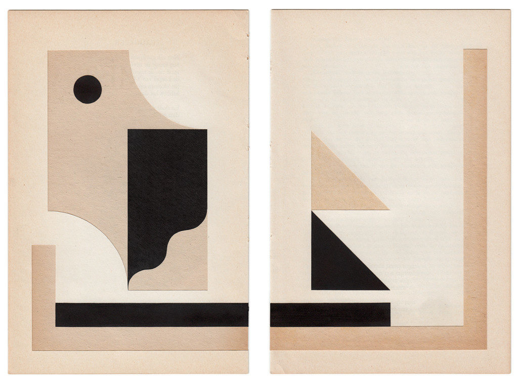
For Sto and and o—an abstraction of the word stoandando, Italian for I’m going —I have tried to put my rigid idiom into a state of motion, as a metaphor for moving on. The different compositions push you in certain directions. It shows a conversation between my soil paintings on wood and collages. Since I cut the wooden boards and construct the panels myself, I created different layers and depths in the panels for the first time, making them look more like wall sculptures than just paintings.
For my forthcoming exhibition at Charlotte Fogh Gallery, I am further developing this sense of motion, or freedom if you like, in my work. I have been too much focused on constantly measuring and calculating to get things perfect. I think it is time to loosen up a bit. In addition, I am exploring the possibilities for using color again after working in black and white for many years.
RF: Before we get into new work, I would like to talk more Sto and and o. The material used for the collage pieces in that show were found-books, sourced by your “personal interest into color, form, theme and balance.” Could you speak more on how you gather these materials and how that process works?
LR: I used to go to flea markets and thrift stores to collect my books, but lately I have been more into browsing archives and the obscure corners of the internet to find my books. Which is also tricky, since I am most likely unable to judge the books on color. My friend and artist Matthew Allen recently sent me a piece of text about Japanese paper that made me realize again how important “color” is in my work;
“Paper, I understand, was invented by the Chinese; but Western paper is to us no more than something to be used, while the texture of Chinese and Japanese paper gives us a certain feeling of warmth, of calm and repose. Even the same white could as well be one colour for Western paper and another for our own. Western paper turns away the light, while our paper seems to take it in, …”
That is exactly what I am looking for in the printed materials for my collages. The printing must be mat at least, the black preferably the blackest ever. I think it is this warmth in paper and print, this sense of depth, that might make you wonder if it actually is printed. It has this kind of hand-made quality to it that really interests me.
I also prefer spaciousness to mask or make full use of the pages’ subject. I like to add or alter as less as possible to show as much of the original image in its new context.
RF: Sto and and o brought your collage work and large-scale wood sculptures into conversation with one another through the use of similar forms in each series. Through these references to visual language, book design and typography continue to feature prominently in your practice. Do you see yourself working towards a larger goal in placing these influences into a gallery context?
LR: It is a way of working that I handle more often; examine a composition into different mediums. The wooden panels move freely in space, where the collages show the same compositions but framed. I do not tend to create new images with my collages but rather use the printed settings and the layout of books as a location for existing or non-existing objects.
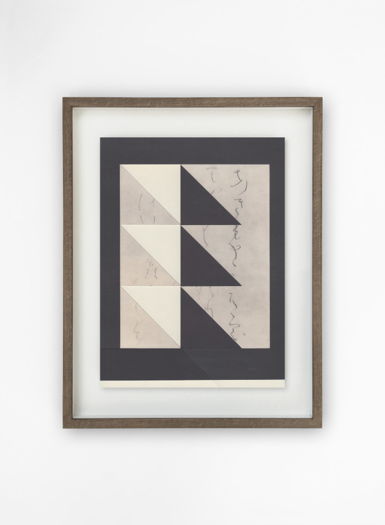
Perhaps it is more clear to me, but I hope—despite the cryptic aspect in my work—to convey some sort of narrative within an exhibition. Although I am also pleased when my pieces work separately from each other. But I certainly make my work with the idea of a bigger whole, as a sort of archive, with different phases and events in my life as a common thread. I’m not very theoretical, I’m more of a visual thinker, but I really enjoy linking theories by others to my work. A collector from San Francisco once told me my drawings on discolored book pages reminded him of pieces of an archive from the future, pages from a book yet to be written, a statement that has been very decisive for my work through the years.
RF: Speaking of your standalone pieces, your album artwork for the latest album ‘Strand’ by Bellows, the Italian electro-acoustic composers Giuseppe Lelasi and Nicola Ratti, also uses negative space, and found-book cutouts for the cover composition. Do you approach your work for an album cover differently than the work you make for an exhibition, or do you see these products simply as a continuation and extension of this same process?
LR: First of all, it was an honor to collaborate with Shelter Press. I have been following their work for almost a decade, back in the Kaugummi days. During the making of my Décor zine in 2016, they already suggested that there might be a second project; a record sleeve. Shelter Press is known for their high quality and well-produced records so I was into it immediately.
What I find so interesting about a project like this—in which I basically lend out my work for an album cover—are the unexpected choices of the designer, in this case Bartolomé Sanson, the man behind Shelter Press. It was very refreshing to me how he used the white. Especially the collages for the inner sleeve got a completely new dimension. It really changes your view on my work, at least mine. Initially they wanted a different design. Nicola and Giuseppe were fond of several pieces from my Archiv series from 2015, but I preferred something new. Bartolomé agreed and eventually came with the three diptychs. The way he merged the white in the images with the white space, the cover—as a physical object—almost seems like an architectural thing in itself.
RF: You recently moved your studio from Amsterdam to a more secluded, country setting outside of the city in a small town called Zetten. Has this change in location had an impact on your studio practice, or do you feel yourself unaffected by geography in terms of your life and work?
LR: To be honest it is a little early to say at this point but both Martine and I do feel a sense of freedom when it comes to our studio practice. We survived some quite tragic events last year and though we’re far from stress-free, moving out of Amsterdam, living closer to our family and being surrounded by nature feels absolutely liberating. The Netherlands is a ridiculously small country compared to the States, so geographically you could say we still live in Amsterdam. But it definitely feels like a big change. Yesterday evening in the studio Martine and I had a chat on how much we have done with the need of proving ourselves. And now it is time for a little fun. Not too much though, I also support continuity and embrace melancholy.
Ryan Filchak is an arts writer, editor and educator based in Chicago. Originally from Lexington, Kentucky, Filchak studied English at Transylvania University, and would later receive his Master’s in Art History and Visual Studies from the University of Kentucky. He currently works as the Publishing Director of the Chicago artist-run space LVL3 and contributes regularly to Newcity. He also believes the Old Fashioned to have originated in the South, despite citing no supporting evidence for this claim.
The author would like to thank Louis for taking the time to talk with him about his work, his upcoming exhibition, his home, and his adoration for jet black ink on paper. Not previously mentioned, Louis recommended he listen to the song “Doe de Waddy Waddy” by Samantha, and for this he is forever grateful.
Sto and and o ran at Loom Gallery from May 18–June 18, 2017.