DIY Documents: Lucas Reif on Design, Print and Language

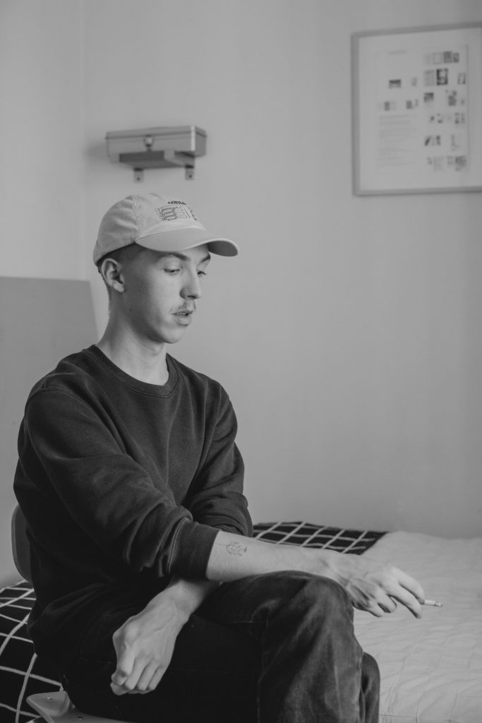
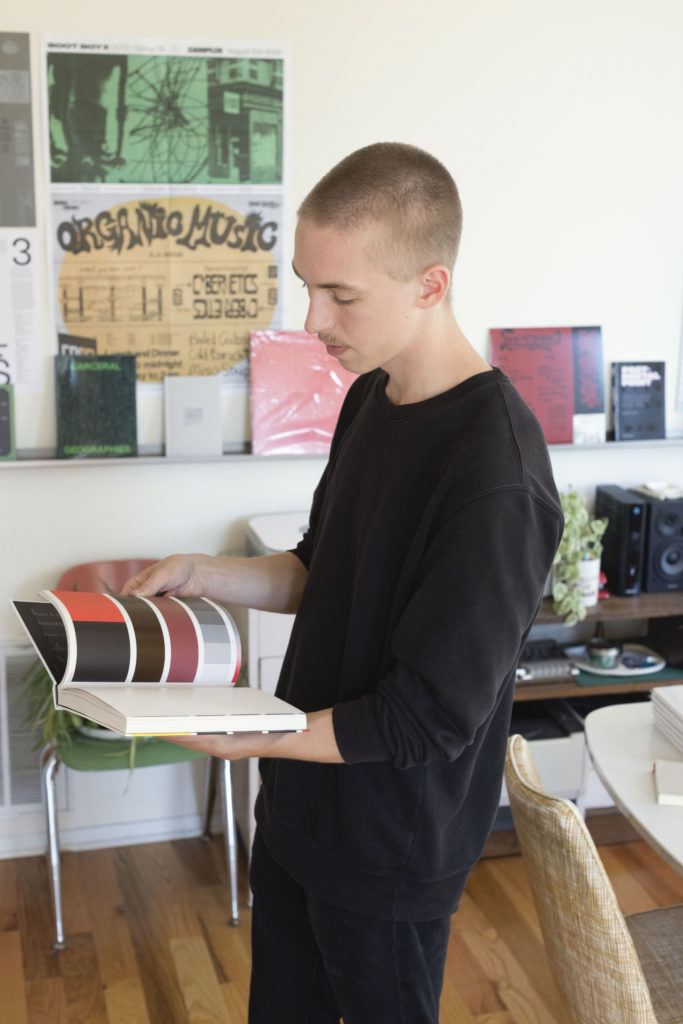
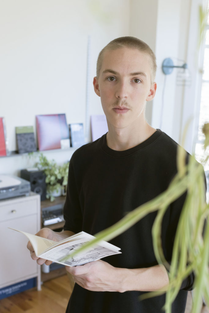
Based in Chicago, artist and designer Lucas Reif uses the process of independent publishing to turn temporal performances and audio imagery into stunning archival objects. As one half of the small press imprint Shelf Shelf, Reif self-publishes his project Disruptor, “a zine publication invested in the exploration of punk, hardcore, noise, and other subcultural sonic communities.” Disruptor compiles interviews, photography, and design to present a refreshing and lasting document that showcases Reif’s deep investment into the visual transmission of language.

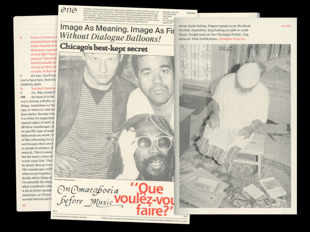
Having most recently premiered Issue Six at the NYABF this past September, the latest iteration of Disruptor focuses entirely on Chicago noise collective ONO. I spoke with Reif about his earliest publishing experiences in Seattle, his current work with Shelf Shelf in Chicago, his influences in the field, and the future for his ever-expanding engagement with print and design.

How did Disruptor begin? Rather, which part of Disruptor came first, your engagement with spaces for DIY, punk, hardcore, and underground music communities, or your interest in graphic design and publishing?

My interest in graphic design definitely predates any serious music or publishing involvement. I started doing a few freelance web and UI design projects around 2010—gimmicky early-Dribbble sort of stuff—but I never found my way into any print design or publishing until Disruptor. I first worked on Disruptor in late 2015, about the time I started more frequently going to punk shows around Seattle—spots like Office Space, Black Lodge, Ground Zero, and Nuthole were where I spent the majority of my time.

Disruptor itself began as my final project for a studio art class in high school. Most of my classmates were painting or drawing, but I was in no way skilled at those things. I couldn’t come up with much to do other than make photographs at shows, and interviewing the musicians around me seemed like a good way to meet people in a somewhat unfamiliar scene. I soon realized, as these venues began to shut down and bands would split up, that the interview format was important as a form of record-keeping. A zine seemed to make the most sense as an end-format, but it was more-or-less by accident that I came across risography and Cold Cube Press, the studio that printed issues one and two.

How did you come across Cold Cube Press, were they also involved with these spaces in Seattle?

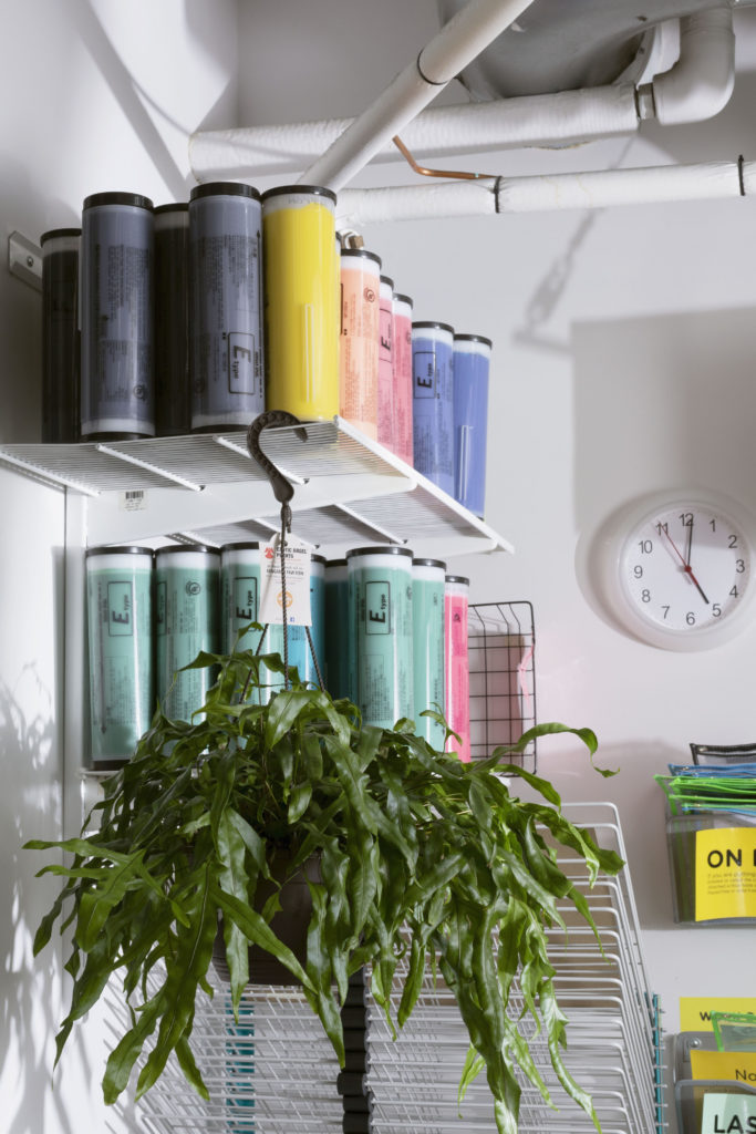
Besides screen printing band shirts, my printing experience up until that time had been limited to a broken HP Photosmart that came bundled with some family desktop computer. I had no clue how to make a book, much less how to approach printing a full edition. I was researching Seattle-area printers and publishers—Riso especially was intriguing to me at this point, although I didn’t quite understand why—and “Cold Cube” was this name that kept popping up, so I reached out over email. It was probably silly for Aidan and Michael, who run Cold Cube, when some high schooler from the Eastside showed up at their studio in Pioneer Square. I strolled in with files for test prints on a USB drive, and I was immediately sent back out the door and told to walk to FedEx to make laser copies for the Riso scanner bed. Then I kind of just stood there and bobbled my head as they explained different weights of paper to me. But it turned out that we were all into the same music, and they were excited to work on the project with me. I remember being really stoked to hear Aidan playing a Diat LP one of the first times I visited. As far as I know, Cold Cube was the only one doing small press Riso work in Seattle at that time. They’re good friends now and are still producing beautiful comics anthologies back in Seattle. We share a lot of printing tips back and forth.

This explains Issues One and Two of Disruptor featuring work from Seattle, but then in Issue Three the focus shifts to Chicago. What brought you there?

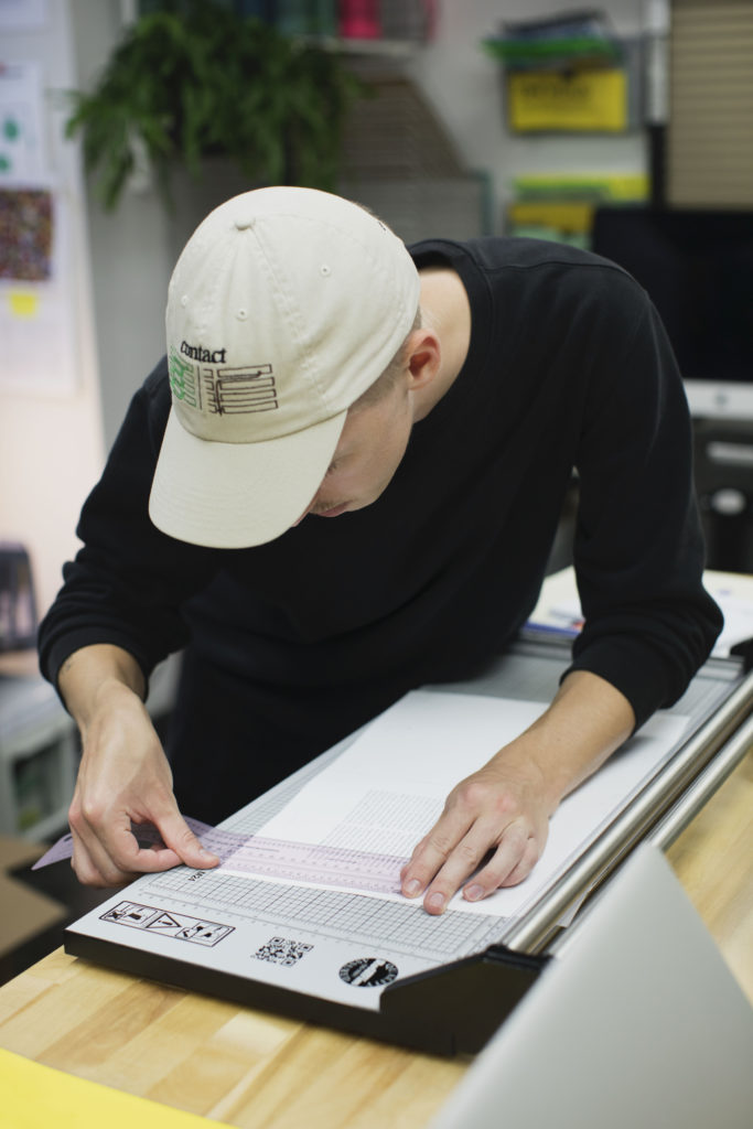
The undergrad design program at The School of the Art Institute of Chicago. When I moved to Chicago in 2016, I found myself immersed in a much larger community of artist publishers and suddenly had the technical resources to begin producing Disruptor (and other zines, books, and prints) myself. I was eager to start printing, so I showed up at the school’s Service Bureau weeks before the semester started and basically begged for a job. Being involved in hands-on production work has hugely informed my design approach; I end up spending a lot of time considering processes of translation from digital to print and vice-versa—these material and formal relationships are just as integral to my idea of design as anything that happens in InDesign or Photoshop.

And despite these changes in location, the latest edition of Disruptor has a very clear mission statement that appears alongside the table of contents. This text proclaims the zine as an “investigative and archival collection of imagery.” Beyond this idea, do you have a set format for each issue of Disruptor?

It’s funny you say that because the mission statement might seem clear and resolved now, but so far I’ve tweaked it slightly for each new issue. Inevitably the scope I set for myself in the previous issue feels too constraining when I begin the next. It got to the point that many of the performances I was photographing weren’t strictly punk or hardcore at all; many of them defied those kinds of genre demarcations, especially in the case of ONO, the self-described “experimental, noise and industrial poetry performance band” profiled in Issue Six. ONO has been active in one form or another since 1980, so, a brief chat about upcoming shows and releases seemed inappropriate. Instead, we recorded an extensive 11,000-word dialogue, which meanders from histories of ONO’s origins to the role of “gospel” in their performances, to racial problematics in Russian cosmism. It’s the strangest and most fascinating text to emerge from this project yet, and in a way, it totally breaks from the previous formats I’ve established. I feel more comfortable now in changing the formula, so future issues may derail even further!

Going back a bit to geography; having lived in Seattle and now Chicago, do you see more similarities or differences in the music communities you have engaged with via this publication?

The nature of my engagement has shifted so much in that time, and the nature of the projects that I’m drawn toward is also constantly changing. Maybe I just have a short attention span. I suppose there’s the obvious difference in scale: Seattle feels very insular, while Chicago feels very sprawling, with projects often overlapping throughout the Midwest. In Seattle, “punk” was something that I was actively attempting to discover by exploring spaces below the threshold of visibility. Again, I’m more interested in projects that push outwards at the limits of that descriptor or projects that refuse it altogether—“punk” can become far too insular. I spoke at length with ONO about the ostracism they faced from Chicago punk clubs in the 1980s and also about the integrative versus segregative potentials of the word “punk,” a word they do not identify with. And so another difference emerges out of the fact that artists operate within (and respond to) given geographies and political histories; Seattle’s and Chicago’s are very different.

Much like the DIY communities you document, Disruptor was initially self-published. Now you distribute the project through the publishing imprint you co-run called Shelf Shelf. Has this always been a long term plan of yours?

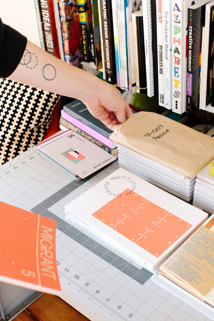
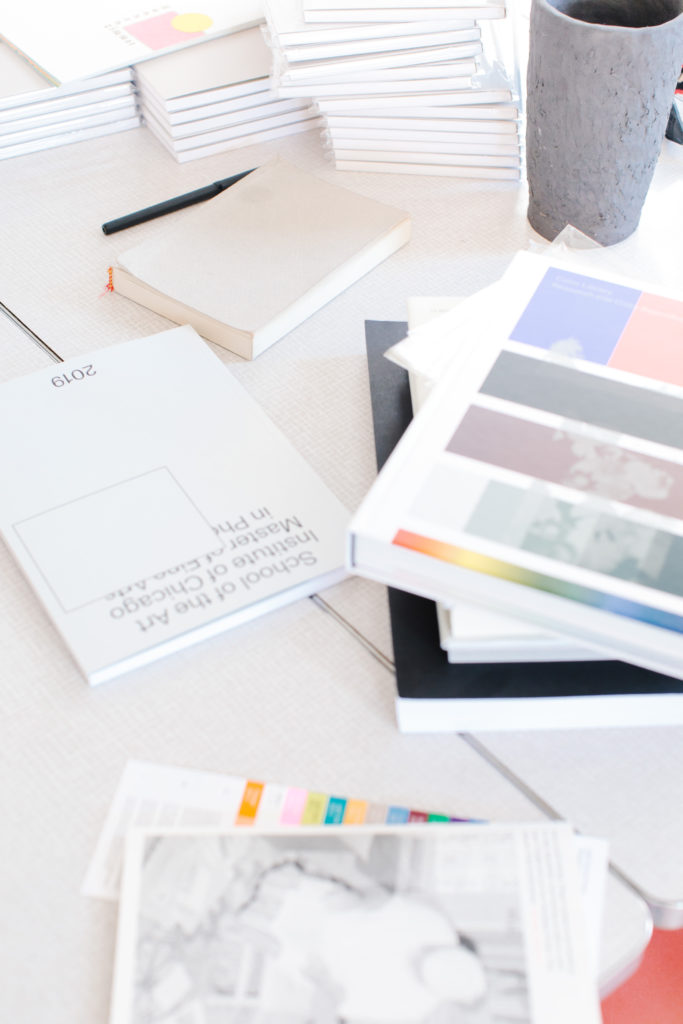
Not at all! Issues Two, Three, and Four were loosely affiliated with a small Seattle record label that I was designing for. Shelf Shelf, which I co-operate alongside Austin White, didn’t come into existence until the release of Issue Five in May 2018. Austin and I were both studying design, working in various print shops in Chicago, and independently publishing books. We were also living together, so it made perfect sense for us to team up. The name Shelf Shelf is literally just by virtue of the fact that we have two wall-mounted bookshelves right next to each other in our living room. I still consider this new approach to be a kind of self-publishing—actually even more so than before because we control the production process to a greater extent—but now we have better distribution networks and a convenient platform for collaborating with artists and writers on a variety of other projects. The more anthology-style works that we publish, such as ON Journal and Poetics of the Ordinary, are always exciting challenges. It’s rewarding to bring together different artists and writers whose work would otherwise never be in dialogue.

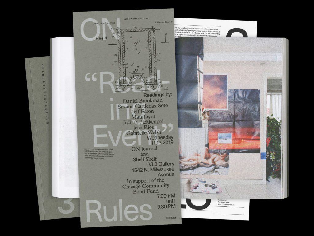
Shelf Shelf has also been especially rewarding of late in forcing us to think about the life of a publication outside and beyond the space of the book-object. So much of our time this past year has gone into coordinating public programming to accompany new works. For instance, in conjunction with this year’s Chicago Art Book Fair, we’re hosting a reading featuring contributors from ON / Rules, as well as a panel discussion on incarceration and sonics.

Creating space for marginalized identities is a high priority for both Disruptor and Shelf Shelf. Do you see this as a needed shift in the world of small print publishing, or one intrinsically tied to the field of alternative press?

Creating space is always a priority, but that space is never something for us to lay claim to. I’m also not interested in curating or editing Disruptor based on a liberal notion of diversity or what Mark Fisher called “sour-faced identitarian piety.” I just go to shows and make photographs and do my best to engage in discussion. It would be reductive for Disruptor to be filled cover-to-cover with white hardcore bros; that would be an awfully narrow conception of the communities operating here. This is largely to say, artists and organizers across many different race/gender/class divides are creating and asserting space for themselves. My goal with Disruptor is to document and provide something of a platform for interesting, boundary-pushing projects, and that inherently requires these kinds of multiplicities. The same could be said of Shelf Shelf’s collaborative approach and of countless other publishers. At its best, small press publishing allows for this because it places the means of production at the level of the individual or collective and creates alternatives to dominant market logics. Community-building and inclusion should be privileged over profit and growth.

Do you have other designers or projects you look to as having influence over your work?

Right now I’m most influenced by Stuart Bailey’s (Dot Dot Dot and Dexter Sinister) writing, but to focus solely on Chicago… I would say that Pouya Ahmadi’s work is doing away with typographic conventions that I didn’t even realize existed. He’s constantly forcing me to rethink my spatial relationship to text as a reader. The second issue of his publication Amalgam recently launched at Inga, which is an invaluable new bookstore and event space on 18th street. It’s run by Malia Haines-Stewart, Jacob Lindgren, and Alan Medina, who all deserve recognition for their organizing and commitment and openness. I’m also especially influenced by the hybrid editing-designing-printing-publishing practices of groups like Temporary Services, OtherForms, and Platform.

In an interview with LVL3 gallery about Shelf Shelf, you were asked about challenges designers face today and what challenges you may anticipate in the near future. In your answer, you said, “graphic design is wholly unethical.” What do you mean by that?

I suppose I didn’t mean to come across as so moralistic, but what I mean is that professional graphic design discourse is self-obsessed and apolitical, and that graphic design reproduces and refines class hierarchy.

Around the time Austin and I did that interview for LVL3 I was working on the design team for a large Chicago-based advertising agency, where any notion of design authorship is twisted into this gross, appropriative commodity-skinning process. I’m not saying anyone designs in a bubble, but the extractive mentalities behind the “moodboard” are so naturalized in these spaces that nobody ever questions them. Maybe it’s just that graphic design is actually inseparable from whatever incantation of semiotic capitalism we’re living through currently. I struggle with this—and I know a lot of other designers who do as well—and it’s because there’s an expectation for graphic design to offer a field of boundless innovation and potential, or tools for communication and political action, but what we end up doing most of the time is regurgitating symbols so completely emptied out of their original meaning and so endlessly disseminated that they become useless in affecting any action at all.

The designer Erik Carter, who’s done a lot of great work with Verso, wrote an interesting op-ed for The Gradient last year that speaks to this topic. His writing about “graphic design’s failure to examine its societal implications” and the “bleak options for a young designer burdened with student debt” certainly hit home. The scope of Carter’s piece necessitates certain concessions that hinder his argument, but I generally share his criticisms, and I think that by actively reading, writing, and publishing, designers can help to sharpen our shared critical literacy and begin to shape that professional discourse. I think we ought to recognize design’s more insidious forms and imagine radically different forms for design practice.

You mentioned earlier an ever-evolving shift in the mission statement for Disruptor. Can you see the format or the project changing in ways that reflect this ideology? Or simply, would you like to see Disruptor grow into something other than its current form?

Absolutely. I find value in endurance but would also like to reject the idea of any resolved format. The sixth issue of Disruptor is the project’s largest departure to date, and it’s also somehow taken me the better part of a year to finish. I’d been collecting such diverse images and writing over the course of several months, and then I ended up totally at a loss as to how to unify all the work. After two months of adjusting type-leading, making minor copy edits, and telling myself, “This weekend you have to go to print,” I realized that I had tried to cram two issues into the space of a single issue in order to match some of the formal characteristics of the existing series. So I basically started from scratch and dumped everything besides ONO, and now I have months of unused photographs, which may or may not end up in another issue. There’s a certain anxiety to this kind of process, but it’s also exciting and liberating not knowing (or needing to know) what the next step will be.

For more from Lucas Reif, follow him on Instagram.

Photography by Nico Segall Tobon.

A Lowdown Southern Odyssey // A Reexamination of Self-Taught Artists in the American South

In 1992, Jonathan Williams wrote the Editor’s Note of his proposed book Walks to the Paradise Garden, writing, “We’re talking about a South that is both celestial and chthonian.”1 Williams—an American poet, founder of the Jargon Society, and Black Mountain College member—wrote this statement to preface his uniquely personal documentation of over eighty artists and eccentrics from the American South. Names on this list include Thornton Dial, Lonnie Holley, Howard Finster, Martha Nelson, Sister Gertrude Morgan, and Little Enis, among others. Through poems, photographs, and prose, Williams’ travelogues described and showcased the talents of a region not dissimilar from the one we know today—a place and identity built on contradiction and societal complexities; hospitable and unwelcoming, sacred and profane.

Roger Manley, Lonnie Holley, Birmingham, AL, 1987. Image courtesy of the artist and Institute 193.

Williams originally intended for his manuscript, along with the corresponding photographs taken by his most frequent road warriors Roger Manley and Guy Mendes, to be published at the time he wrote the aforementioned note. Though, due to a lack of interest, these attempts at publishing proved unsuccessful for Williams. Twenty years later, Mendes suggested to Institute 193 founder Phillip March Jones that they publish Walks to the Paradise Garden, or as he had suggested they call it, Way Out People Way Out There.  With the help of Manley and Mendes, Jones took on the task of organizing a single cohesive volume encapsulating Williams’ now posthumous project. In 2019, Walks to the Paradise Garden was published on the occasion of a corresponding exhibition at the High Museum of Art in Atlanta titled Way Out There: The Art of Southern Backroads. 

Named after Howard Finster’s Paradise Garden in Pennville, Georgia, this atypical book of art history reads like a road map of the South (Florida excluded),2 and given the delayed publishing date, as editor Jones writes, thus operates as an account “both ahead of and firmly grounded in its time.”3 Williams’ jaunty and loose voice makes no apologies for his approach to the artists he champions, and Mendes’ and Manley’s photographs capture an aesthetic of a region that is often misunderstood. “It’s a collection of outlandish findings by three Southern Persons, all white and all male. This is something we don’t really fret about, and hope you won’t either. May we please both okra-eaters and non-okra eaters alike!”4 writes Williams. Often working within the confines of poverty, racial discrimination, and cultural invalidation, Willams’ enthusiasm and commitment to profile these artists humanizes their efforts, where others faltered to acknowledge the undeniable richness of creativity residing below the Mason Dixon. Manley describes Williams as, “like having Churchill visit you, he was equally comfortable talking to royalty as he was a gravedigger.”5

Despite the lack of academicism in Williams’ prose, Walks to the Paradise Garden serves as an intellectual bridge between two museum exhibitions that both feature artists profiled in the book; the seminal Black Folk Art in America (1982) curated by Jane Livingston and Jane Beardsley at the Corcoran Gallery in Washington D.C., and the de Young Museum in San Francisco’s Revelations: Art from the African American South (2017). While Black Folk Art in America represented a moment for artists like Mose Tolliver and Sister Gertrude Morgan to have received recognition as artists in any capacity, Revelations  functioned as a ground for further examination into the lives of living artists such as Lonnie Holley and Thornton Dial.

Each of these exhibitions possessed the curatorial mission to exhibit Black artists from the South—a parameter Williams had not placed on his own research—yet, all three projects highlight the presence of spirituality common amongst the work. In the exhibition catalog for Black Folk Art in America, curator Jane Livingston writes, “Virtually every artist in this exhibition claims to have been commanded by an inner voice or by God to make art. On the face of it, we discover a nearly unanimous testament to personal revelation.”6 Between Eddie Owens Martins, known as St. EOM of Pasquan, and Howard Finster, Williams profiles two additional examples of artists who prioritize the influence of religion in their practice, each in support of Livingston’s claim in their own right. Finster, a fire and brimstone Baptist from northwest Georgia, follows the voice of the Old Testament to construct the works he displays in Paradise Garden, and the other, St. EOM, follows the beliefs of a self-made denomination, and from this practice built his own artist site, the “Land of Pasquan.” Whether drawing on the imagery of Christianity, or the Post-New Age movement of Pasoquanynism, these two artists represent two sides of the same coin—where site and spirituality homogenize a Southern art vernacular.

Beyond conceptual themes, the exhibition entitled Revelations represented how current institutions have begun to expand their collections of self-taught artists. From an objective standpoint, Revelations represents the acquisition of sixty-two artworks from the William S. Arnett Collection of the Souls Grown Deep Foundation. Acts of institutional inclusion like this—such as the recent acquisition of fifty-seven works by the Metropolitan Museum of Art, also from the Souls Grown Deep foundation—has caused an increase in market value for self-taught artists on the secondary market. Adding to a litany of dualities, Walks to the Paradise Garden delves into only two examples of such financial matters that forecast today’s financial climate: one, a promising reflection on Arnett’s patronage of Southern artists, and the other a cautionary tale of exploitation and copyright infringement.

“[William S. Arnett] has firm arrangements with some twelve artists. In exchange to the right of first refusal of what they make, he pays them each $1,000 a month,” writes Williams “It sounds sensible and fair to me.”7 By this account, Arnett’s methods look progressive in comparison to current models of commercial gallery representation. Contrary to Arnett’s methods, the tale of how Cabbage Patch Doll inventor Martha Nelson had her ideas copyrighted by a man who sold her original baby doll designs named Xavier Roberts, resulting in a five-year long lawsuit, stands as proof of exploitation occurring at this same time for these Southern artists.

Roger Manley, Vollis Simpson Whirligigs, Lucama, NC, 1988. Image courtesy of the artist and Institute 193.

In addition to commercial value, Revelations addresses the current effort to reexamine the language surrounding the field of Southern self-taught artists, claiming the adjectives of “outsider,” “folk,” or “naive” reductive and inadequate. Williams’ own use of language further humanizes artists previously unmentioned in such a context. “Figures with a touch of Miró and Dubuffet play guitars; wagons and horses move,”8 he writes of the wind machines made by Vollis Simpson in North Carolina. Continued efforts by collections like the High Museum, publications like Raw Vision Magazine, and non-profit spaces like Intuit: The Center for Intuitive and Outsider Art in Chicago, have all admirably exhibited work from the American South for decades now, contributing to the discussion of potential classification. Furthermore, the willingness of institutions like the de Young Museum to contextualize the origins of this visionary work in terms of both American and global art history in a museum setting, further validates Williams grand gestures of inclusion.

In discussing the subject of this paradigm shift, Editor Jones notes, “I think the increased art world attention around the work and lives of self-taught artists represents an acknowledgment that creativity, ambition, and even genius, can reside with individuals who are not formally integrated into the financial and educational systems of the world. I have always been perplexed by the barriers to entry but am glad to see them being somewhat relaxed.”

Walks to the Paradise Garden, now in its second printing, stands tall as testament to the diversity and importance of artistic achievements made by men and women of color, and as well as by artists working with mental and physical disabilities. Their shared lack of resources, regional disparities, and societal marginalization are not positioned as a hindrance to their creative output, but instead point to the systematic failings of an art economy that accounts for such delayed recognition. Williams’ manuscript, now exhumed, provides a welcome catalyst for the reexamination of the discourse surrounding self taught artists, both in relation to the major museum efforts for inclusion and the shifting language used to place this work within a larger canon of art history.


Way Out There: The Art of the Southern Backroad at the High Museum of Art in Atlanta ran from March 2–May 19, 2019.

Revelations: Art from the African American South at the de Young Museum in San Francisco ran from June 3, 2017– April 1, 2018.

Walks to the Paradise Garden, by Jonathan Williams, Roger Manley, and Guy Mendes, was published by Institute 193 in 2019.

Guy Mendes, Sister Gertrude Morgan in her Everlasting Gospel Revelation Mission, New Orleans, LA, 1974.
Guy Mendes, Honky Chateau, Versailles, KY, 1988

Fall Arts Preview 2019: Alternative Spaces in Chicago

A mock-up of Lawrence & Clark booth at Julius Caesar’s upcoming miniature art fair, Barely Fair/Photo: courtesy Lawrence & Clark.

Chicago’s most prominent cultural institution, the Art Institute of Chicago, once shared the qualities of what can be loosely defined as an “alternative space:” an artist-run, noncommercial gallery that exhibited primarily local artists in a fixed space on a continuous basis. “It is interesting and, in the light of history ironic, that the entity against which virtually all the alternative spaces have worked, the Art Institute of Chicago, was founded in 1866 by a group of artists,” longtime MCA curator Lynn Warren wrote in the 1984 exhibition catalog for “Alternative Spaces: A History in Chicago.” The connection made by Warren speaks to the importance and possibilities of artists who work outside of traditional galleries and models. An amorphous ecosystem of rooms, projects, administrators and participants continues as part of the city’s fringe history of “rejection and rebellion” through daring and experimental approaches to contemporary art. This all-too-brief overview of Chicago’s alternatives showcases people and places working within this tradition and their programming scheduled for fall.

Apparatus Projects

Since 2018, co-directors Gareth Kaye and Julian Van Der Moere have operated Apparatus Projects from the dining room of a Lincoln Square apartment. After hosting eleven exhibitions and eighteen artists in one space, the pair are changing their format: the curatorial and publishing platform will no longer exhibit in a fixed location, but will operate Apparatus Projects in a traveling format, with extended dates for each show. In October, at a yet undisclosed space in Logan Square, Apparatus will host their first traveling exhibition: a group show featuring artists Caroline Kent, Sterling Lawrence, Shir Ende, Robert Chase Heishman and Thomas Huston. Apparatus Projects will also team up with publishing imprint and collaborative design practice Shelf Shelf for ”Sleeper Cell”. Through an open call, “Sleeper Cell” will pair artists with “sleepers”: the artist will install work in the sleeper’s bedroom. Further challenging the alternative space model, those participating will then write about their artist pairing, culminating in a print journal archiving the project.

Artwork by Kaitlin Smrcina, image courtesy Baby Blue Gallery

Baby Blue

Run by artist and curator Caleb Beck, East Pilsen’s Baby Blue gallery has been exhibiting artists in a warehouse of studios across the street from the Skylark bar since December 2017. Beginning with a solo exhibition by Minami Kobayashi, Beck has hosted an impressively large number of shows in a short amount of time. In an interview with Comp Magazine, Beck says he will extend the run of shows from four to six weeks and will focus on group exhibitions that feature two or three people. Baby Blue opens a group show on September 20, “I Know You Would Never Laugh At Me,” featuring works by Darius Airo, Spencer Harris and Kaitlin Smrcina.

Chicago Manual Style

Located in West Town, curator, writer and contemporary art critic Stephanie Cristello runs a garage gallery that elevates the model of alternative spaces with an international roster and exceptional research-driven programming. The gallery’s first 2019 show was “Saturnine,” featuring artists Theodora Allen, Antoine Donzeaud, Assaf Evron and Wim van der Linden, an exhibition chosen by Artforum as one of its Critics’ Picks. The gallery will bring German artist Sarah Ortmeyer to the space this fall in conjunction with EXPO Chicago. Known for her humorous and allegorical installations, Ortmeyer has exhibited only a few times in the U. S., and this will be her first show in Chicago.

Installation view, “Teyo’s Lightshield: Hyun Jung Jun,” inaugural exhibition of Fresh Bread, 2019/Photo: courtesy Fresh Bread

Fresh Bread

The Rogers Park artist-run project space held its inaugural exhibition, “Teyo’s Lightshield: Hyun Jung Jun,” in July. Fresh Bread co-directors, writer Kim-Anh Schreiber and artist Morgan Mandalay, host shows in their kitchen “that meditate on metaphors of digestion.” Reservations are recommended, where each show is paired with an accompanying cookbook and documentation of process and practice. Programming will commence in late September with a solo show by Siera Hyte, followed by an exhibition by Max Guy in October.

COBRA, “Rat Museum For Rat,” 2019. Rat trap, acrylic on canvas, wood panel, 4.5 × 6 × 15.25 inches/Photo: courtesy the artist and Good Weather, North Little Rock.

Julius Caesar

Founded in 2008, Julius Caesar operates under the direction of an ever-evolving collective of artists. The current co-directors are Josh Dihle, Tony Lewis, Roland Miller and Kate Sierzputowski. In an admirable and ambitious move, Julius Caesar will host a 1:12 scale miniature art fair for alternative spaces, Barely Fair, during EXPO Chicago. “The fair will contain a layout of approximately twenty-four contemporary miniature and full-scale galleries,” says Sierzputowksi, “and is designed to mimic the layout of a standard fair.” The fair will bring in alternative space participants from Chicago, the greater United States and around the world. Confirmed galleries include; Bozo Mag (Los Angeles), Club Nutz (Tyson Reeder and Scott Reeder, Chicago and Detroit), Serious Topics (Inglewood), Five Car Garage (Los Angeles), Flyweight (New York City), Franz Kaka (Toronto), Good Weather (North Little Rock), The John Riepenhoff Experience (Milwaukee), Lawrence & Clark (Chicago), Loo Gallery (Chicago), Monaco (St. Louis), MPSTN (Chicago), Odd Ark-LA (Los Angeles), Outlet Gallery (traveling), The Pit (Los Angeles), Prairie (Chicago), Produce Model (Chicago), The Suburban (Milwaukee), BLITZ (Malta) and EXO EXO (Paris).

LVL3

Wicker Park gallery LVL3 operates as an exhibition space and online publication, showcasing artists, designers, musicians and creative entrepreneurs. Through their interview series, LVL3 pairs Chicago artists with artists living outside the city in a direct method of community building. LVL3 begins the fall season with the two-person “Question and Answer,” featuring Roni Packer and St. Louis-based artist Lyndon Barrois Jr. Director Vincent Uribe has published interviews and hosted exhibitions for almost ten years, and LVL3 space stands as a testament to the rewards of consistency and persistence in a field that guarantees neither.

photo courtesy of the artist Joel Dean

Prairie 

Co-directors Jack Schneider and Tim Mann initially ran Prairie, an exhibition space for contemporary art and a platform for critical discourse, in a shared studio space in a mixed-use warehouse in Pilsen. The name of the gallery refers to the region of Chicago prior to colonization and industrialization, and themes of lasting impact and interrelated social issues often appear in exhibitions. After hosting an average of six shows each year since 2017, Prairie closed at the end of 2018 and reopened in a renovated storefront on West Cermak in February 2019, for greater public accessibility. Prairie opens “Evolve Right Now” on September 13, an exhibition by former SAIC graduate and mixed media artist Joel Dean. 

Let Me Consider it from Here // The Renaissance Society

Once a street is well equipped to handle strangers, once it has both a good, effective demarcation between private and public spaces and has a basic supply of activity and eyes, the more strangers the merrier.

—Jane Jacobs, The Death and Life of Great American Cities

Curated by Solveig Øvstebø, this latest exhibition at the Renaissance Society brings together sound, painting, and sculpture to address the peculiar middle ground that exists between public and private space. As a result, the four artists included in Let me consider it from here inadvertently challenge the axiom that all art is political. The lines drawn from Saul Fletcher, Brook Hsu, Constance DeJong, and Tetsumi Kudo do not trace visual similarities but instead weave a thick, dense fabric of the personal and of language. Spanning multiple decades and backgrounds, through this exhibition each artist shares powerful examples of how to control their movement within and across these spaces.

Saul Fletcher’s photographs read as a line of free form poetry, economic in word choice, unconcerned with a sonnet’s structure. “Untitled” can often stand in for the mysteries of composition, but Fletcher is working to reveal himself through the literal lens of a camera. Studio tableauxs and portraits provide the viewer a glimpse of Fletcher’s personal narrative, but that which we can see comes as a result of careful deliberation. These pieces act as telescopes focused on fixed points. Distance and caution make up the language of Fletcher’s work, but the striking images invoke curiosity, and the moves made between his private studio and public participation garner the viewer’s undivided attention and respect.

Let me consider it from here, Installation View, 2018. Photo: Useful Art Services.

Tetsumi Kudo (1935-1990), best known for his brazen public works most often associated with the Anti-Art and Neo-Dadaist movements of the 1950s and 60s, acts as the godfather of this otherwise unlikely group. The only artist not living, Kudo has received an art historical reappraisal in the last decade in part due to his increasingly understood influence on Paul McCarthy and Mike Kelley. Ironically, Kudo’s reassessment and praise of the last decade stems from his relatively less confrontational works after he moved from Japan and began to work in a Paris studio. During this time, Kudo’s practice ceased addressing the global political anxieties of post-war Japan and instead shifted inward to self-portraiture, introspection, and sculpture.

Through elements of kitsch and outsider art, the seven highly representative sculptures on display at the Renaissance Society provide a glimpse into the creator’s own despair of personal erosion. Fragmented anatomical forms, often phallic, commingle with brightly colored accessories in aquariums and bird cages. The works in Let me consider it from here were never shown in the United States during Kudo’s lifetime, and for this reason alone his posthumous resurgence seems understandable. These surrealistic moments of inner turmoil find a linkage both apolitical and universal that foreshadows the current contemporary climate, wordlessly speaking a language of concern artist Brook Hsu grapples with in a powerful way.

Brook Hsu, Two Trees, 2009. Courtesy Of The Artist. Photo: Useful Art Services

Hsu’s intensely candid and generous work takes note of Kudo’s legacy and resolves the inevitable maintenance of the conflicting public and private life of an artist through alternative measures. “It’s not something I really talk about, but creating a space for spiritual practice in art making is something I care for deeply. Mythical figures such as the ancient Greek god Pan and fairies serve the role of what I call a “spiritual surrogate”, a god that I can relate to,” Hsu said in an interview with Elephant. Kudo left performance in favor of an isolated practice, where as Hsu engages through methods that hope to intercept misrepresentation.

Hsu’s large works of acrylic on store-bought carpets best serve this self-prescribed process of self-mythologization. Spanning two white painted carpets, Hsu’s particularly stunning piece Earth Angel (2017) depicts one of these such “spiritual surrogates.” In red outline, a human form in the flexible crouch of a four legged animal looks behind itself onto a backside that invokes a watermelon patch. Blue flowers and vines overlap the figure, spanning the height and width of the piece. The bizarre and pleasant imagery links Hsu to Kudo, but her material choice gives credence to the stains that do not share the same lines as the figure or the fauna. Her gods have been stepped on.

Let me consider it from here, Installation View, 2018. Photo: Useful Art Services.

Fortunately for these artists, they have found spectacular company and each share the valiant effort to pursue the ways in which language—visual or otherwise—can cure what ails us. Dejong’s audio pieces attest to these efforts. From the Nightwriters series, these four monologues recall the restless nights of sleepwalkers. The audio pieces explore the language of the subconscious and the personal space that which their speakers can not control. Unlike the other three artists whom rely on a developing aesthetic, Dejong’s work deals with a loss of control over, and not the maintenance of one’s public and private self.

Despite these artists attempts to craft their own careful patterns of movement between these two worlds, the Renaissance Society remains a crowded room. Not crowded in the sense of an exhibition superfluously hung, but crowded in a way that effectively imitates and critiques the current informational zeitgeist. Best laid plans of control must inevitably compete with the plans of others, and for those maintaining a specific personal agenda, this leaves only a future of uncertainty. However, these artists, in each their own way, prove this quest for personal agency, an agenda well worth our consideration.


Let me consider it from here runs at the Renaissance Society until Jan. 27, 2019.

Escaping the Archivist’s Folly: A Review of Jeremy Bolen at Soccer Club Club

Jeremy Bolen, “S-214713 1948/2018, Yerkes Observatory/Chicago,” 2018, Glass plate negative from Verkes Observatory, chromogenic print exposed to Chicago night sky, volcanic ash from Mount St. Helens, 20 x 24 inches

Camille Henrot’s 2013 video piece “Grosse Fatigue” brings the weight of encyclopedic knowledge of human experience and demonstrates how the ever-increasing accessibility of information can overwhelm to the point of paralysis. Henrot suggests that those given the choice to do anything will simply do nothing. This meditation on the current mediascape and twenty-first-century image culture exacerbates how visual clutter, all classified, sorted and catalogued, can overwhelm the archivist to the point of exhaustion and futility.

The folly of the archivist—to know it all, to see it all—does not affect Chicago-based artist Jeremy Bolen. It seems this same approach to data, instead of overwhelming, calms the researcher, at least in their pursuit of alternative methods of documentation. In his exhibition “Casual Invisibility,” Jeremy Bolen continues with previously visited themes of scientific knowledge in relation to empirical observation, but for this work, the material source now includes glass plate negatives from the Yerkes Observatory in Williams Bay, Wisconsin.

Jeremy Bolen, installation view of “Casual Invisibility” at Soccer Club Club, Winter 2019

The Yerkes Observatory’s archive of astrophysical data runs parallel to Bolen’s attempts to create a visual language for that which cannot be seen by the naked eye. His access to these materials informs his current body of work directly. Whereas Bolen uses sculpture to enliven field data research involving environmental slow-violence, the negatives from the Yerkes’ refracting telescope, the largest ever used for astronomical research, give a visual platform to that which no one had ever seen previously, in the gallery or otherwise.

Jeremy Bolen, “Zion, Illinois Burial #5,” 2018 / Photo: Tex Print from buried infrared film, 54 x 42 inches

During a residency with Latitude this past June, Bolen worked the plate-glass negatives amongst other materials and research from various scientific institutions in the Midwest into the hybrid objects now on display at Soccer Club Club. These pieces work best in reversing the plaque/artifact dynamic. Neither exclusively photographs nor archival objects, Bolen blends these items into a pleasing display of the formerly unnoticed.

The overlap and intersection, present amongst the sculptures and images for “Casual Invisibility,” adhere to the geometry of ninety-degree angles, and thus, operate as highly aestheticized spreadsheets. Contemporary in their abstraction and cleanliness, the works function as visual addenda to the titles in which they find themselves reclassified.

For instance, “Zion, Illinois Burial Film #5” sources buried infrared film from the former Zion Nuclear Power Station for the structural component of the piece. Wedged into one corner of the room, the print of this image, framed in black, leans against one of the mirrored walls of the former Polish sports bar, and also leans against a black and white landscape, mounted flat the leaning print obscures the full image from sight. This piece serves Bolen’s interests in phenomena and geological time while also incorporating the space to emphasize the reproducible nature of the data which goes unseen. Most admirably, Bolen boldly positions his own work within the same ephemeral state as the research in which he sources.


Jeremy Bolen’s “Casual Invisibility” shows through January 12 at Soccer Club Club, 2923 North Cicero, with a closing party 7pm-10pm on January 12, with a DJ set and musical performance by Good Fuck.

Laughing at the Image Screen: A Review of Sara Greenberger Rafferty at Document

Sara Greenberger Rafferty, “8” 2018, Gelatin silver print mounted to 8-ply archival board, 20h x 16w inches, Edition 1/5

Nine black-and-white images of a mouth, printed in gelatin silver and mounted on matte-black archival board, hang in stoic repose against Document’s southern wall; nine sets of lips and nine mouths, unspeaking, each lit by an overlapping numeral respective of the order in which each print appears in the series. These nine semi-portraits, of indeterminate gender and identity, hang equidistance from each other and in uniform height. From here these images will undergo further manipulation through repetition. Behind the framed pieces, more mouths appear, edited and composed within a larger digital collage that when viewed from a distance resemble the iris and pupil. In this effort to layer the tools and methods of perception, Sara Greenberger Rafferty layers and teases the image screen to a hypnotic effect.

Sara Greenberger Rafferty, “Dollar Test (University of Michigan Extension)” 2018, Acrylic polymer and inkjet print on acetate mounted to Plexiglas, 16h x 20w inches

The Chicago native’s exhibition, “The Laughter,” sources the ephemera of pre-digital photography in service to a highly advanced, process-based post-digital printing practice. Discarded materials of commercial film photography, often used for light and color testing, sometimes in the form of slides, provide her materials for her collage and multimedia-based works. In her second solo exhibition with the gallery, instructional-based mediums such as slide film receive the treatment and consequential gravitas of the museum archive.

Best seen in “Red Hand,” Rafferty prints the image of a former slide onto acetate, paints this printed surface with acrylic polymer and mounts this work on plexiglass. Image aside, the tension contained within this process and these materials disrupts the formerly pristine surface. Textural imperfections contradict the delicate printing methods involved to make this body of work. The outstretched hand, palm up, ready to receive, now presents itself torn, warping the former tools of perspective and placing the image into conflict with itself.

Let me consider it from here, Installation View, 2018. Photo: Useful Art Services.

The punchline lies within Rafferty’s less complicated treatment of her own cultural artifacts. Text and images pulled from her phone, selfies, text notes, and so on, make up the vinyl wall coverings that provide the backdrop for another exhibition piece in the same fashion as the nine semi-portraits. “Eye Test (University of Michigan Extension)” follows the process method of “Red Hand,” but instead repeats the ocular motif of an eyeball with a greater degree of abstraction. Rafferty’s maximalist display of digital clutter behind this piece, although seemingly personal, more closely mimics the cold inner workings of a hard drive or circuit board. This ever-growing network of digital communication, like the Kodak gray scales, provide information that is neither harmful nor unimportant.

Recent exhibitions by Rafferty have used more specific references to female comediennes such as Joan Rivers and Kathy Lee Griffin to address her concerns of sensory perception. “The Laughter” employs more overt symbolism to rework the value we place on photography’s history and our ability to preserve the tools and methods of the medium as it actively works against our own unmitigated physical perception. (Ryan Filchak)


Sara Greenberger Rafferty’s “The Laughter” shows through December 22 at Document, 1709 West Chicago.

Hand in Hand with the Handless

Jason Dodge’s sculptural practice adjusts our material world to build moments of narrative, connection, and potentiality through the lens of natural phenomena. The collections of objects involved in Dodge’s practice do not so much stun the viewer into misunderstanding, but instead entice the viewer to engage in a limitless unraveling—what the artist calls the “inward spirals,” or “vortexes in singular things.” Since his first solo exhibition at Casey Kaplan in 1998, Dodge has brought attention back to the alchemical process of things, bringing a mystic contemplation to the otherwise banal and overlooked. In conjunction with his upcoming exhibition at the Neubauer Collegium for Culture and Society at the University of Chicago, Ryan Filchak and Dodge discussed the artist’s methods toward exhibition design, his collaborations with poets, and working with curator Dieter Roelstraete.

Ryan Filchak: In the past, you have cited a continual pursuit of new working methods for your exhibitions. How do you feel your approach towards your recent exhibition at Casey Kaplan, Jason Dodge: hand in hand with the handless, reinvents your thinking process towards the presentation of your work?

Jason Dodge: In my last several exhibitions, I thought about how much to touch something and how much not to—being a part of what we are doing as people moving around in the world, participating, and trying to understand, isolating some of the things that fall from us while we are living and trying to lend then force in rooms. I guess it is always evolving.

Jason Dodge, installation view at Franco Noero, Turin. Courtesy of the artist, Franco Noero, and Neubauer Collegium.

RF: The subjects you address in your work, regardless of how you much you as the artist may touch them, trace the infinitely complex possibilities of how objects change over time, and travel through space. Do you care to elaborate on the process of this selection, and why these themes of connection remain a high priority for you?

JD: I like how we (people) use things while we are alive—things made from the same atoms [as us], things that take up space and are our mirrors (cell phones, cars) and our embarrassment (islands of plastic in the Pacific, guns). We pass things, like jewels, on through our families and discard an unused packet of soy sauce after a takeaway meal. Things in the world are like words, they come as they are, and can be infinitely reimagined and ordered in ways that open new worlds and to reflect on our own. The same words can exist in a diary or a political speech, and I see the sculptural manipulation of those words as a platform where their meanings meet their possibilities.

RF: It is interesting you bring up the mutability of language. The title for hand in hand with the handless comes from the 2011 poem “Recurring Awakening” by Franz Wright, and although the works in the gallery contain neither titles nor text, poetry does play a key role in your practice. You treat everyday objects in the same way a writer or poet shapes words at their disposal. Do you find solace in this approach to endless possibility, or do your attempts to attach meaning to the limitless reality of personal experience overwhelm you?

JD: That is a nice question. I do not really know how to answer, because I do not feel like I place myself in the role of writer, as the object of personal experience, or as messenger of meaning. The question of where I exist in relation to the work constantly shifts. I feel most comfortable as a harbinger, or at least operating in real time, something like diving into the present—this is one of the reasons why I do not engage in specific meaning. I see myself engaging with the act of reading more than writing. Perhaps the things I use to make the work are like tools used to read, and that is why they are similar to words, as words are also tools to read. I do not think meaning belongs to me.

Jason Dodge, installation view of Jason Dodge: hand in hand with the handless, 2018. Courtesy of the artist, Casey Kaplan, and Neubauer Collegium.

RF: Recently I read your lecture on sculpture, entitled “Subtractions,” and realized that asking about a potential shift in emotion—between the restful and the sublime—has more to do with the projections of my own reaction to your work. Through the exploration of our material reality, there is a transition that occurs from curiosity, to understanding, to connection. This trajectory works so profoundly within the viewer’s experience.

To continue this analogy of reader and writer, for your exhibition at the Neubauer Collegium in Chicago you will be working with curator Dieter Roelstraete. Have you worked with him in the past, and how would you describe a curator’s role in relation to your ideas of exhibition making?

JD: Dieter and I have had an ongoing conversation for the past decade at least, and I suspect that the project we will make in Chicago will connect to this. The poet Ishion Hutchinson will also be a part of the show and will be authoring a poem that is read within the exhibition, and is meant as a text for taking away. What is exciting to me about the Neubauer Collegium is that it is not only a chance to experiment, but for that experimentation to be used, debated, and discussed by the students at the University of Chicago. Hutchinson and I also have an intense ongoing conversation about imagination and working in our various ways. Several years ago, I published a volume of his poems, and it seems like a logical extension of our conversations to make something together again in a very different context.

RF: This role of publisher reiterates your perceived role as messenger—do you see these secondary interactions as a part of the work, or again, simply the message you intend to carry?

JD: The publishing comes from a place that one person’s work, i.e. myself, is not enough. I wanted to find a way to work with poets in a way that involved making something together, and in the case of fivehundred places, it is to make books of their poems. The books function as an attempt to introduce poetry in a way that anyone reading those poets can read them for themselves as opposed to through me. In the last years, I have limited what comes into my work, and essential to that is including other voices, not on my terms. In the case of Hutchinson’s work for the Neubauer, I asked him to write a poem for the exhibition that will be taken away— meaning that its frame begins with my work and ends without it. I also mentioned to him that the title of the poem would also be the title of the show, and that I would take no influence over that.

Jason Dodge, installation view of Jason Dodge: hand in hand with the handless, 2018.
Courtesy of the artist, Casey Kaplan, and Neubauer Collegium.

RF: Have you always sourced your titles from other poets?

JD: I have been trying to eliminate language from my work for a long time, step by step. Now I do not use language for my works. For the last two years I have mostly asked poets for titles, but the show at Kaplan this year was the line from Wright that I love so much.

RF: After speaking about this collaboration with poetry, I am now thinking about both Hand in Hand with the Handless and your ongoing installation A Permanently Open Window. Where one is a collection of material objects in a gallery, and the other is a manipulation of withstanding architecture.

JD: Yes—I have been thinking a lot about things that barely come in and out of focus, sometimes litter, cheap things, or things with the sort of blankness of utility because they can be tuned to something heartbreaking, destructive, lonely. I am also interested in how slight the touch is, like how a plastic bag might sit around for years, then used once to carry something from one place to another and discarded. There is a lot of potential in the cruelty of the use, and cruelty to the ecology of the planet. I want to explore these emotional notions from as close as possible. In Chicago, I have planned very little and am trying to engage with things that same sense—how much to touch something and how little to touch something.


Jason Dodge at the Neubauer Collegium for Culture and Society at the University of Chicago runs through December 21, 2018.

Navigating Desire Between Connection and Anonymity: A Review of Christopher Aque at Regards

Christopher Aque, Installation view of “Idling” at Regards, Spring 2018 /Photo: Brian Griffin

His second show with Regards, Christopher Aque’s latest exhibition, titled “Idling,” showcases his multidisciplinary artistic process through intricate exhibition design and a continued personal narrative told through video, sculpture and photography.

Aque addresses both his own sexuality as well as “Queerness” and “Otherness” in a broader contemporary context by using the culture of cruising as a foundation of source material for his work. Although the exhibition text provides an explicit first-person narrative of Aque’s life, relationships and mindset, his sculptures and mixed-media documentation carry so little autobiographical content that their application reaches suspect levels of banality.

Christopher Aque, “Summer,” 2018, UV-C-exposed gelatin cyanotype on glass in acrylic frame, 20 x 18 inches, Edition of 3 + 1AP /Photo: Brian Griffin

For instance, “Erasure (apart)” and “Erasure (together),” are two sets of motion-deactivated UV-C germicidal lamps. In “Erasure (together)” the lamps are mounted vertical and parallel to one another, whereas in “Erasure (apart)” the piece mounts the two lamps horizontally and on either side of the wall at the top of the staircase in the back of the gallery, causing the viewer to walk ostensibly through the work. Both sets of lamps first appear as found objects, but in truth, their seamless construction is a testament to Aque’s fabrication techniques and skilled ability to have his work blend into the gallery. While inconspicuous in an architectural context, these pieces do well to address and contribute to concepts of public sex, gay identity and queer futurity.

Each “Erasure” piece deactivates with human presence, never allowing the blue hue the pieces emit to occupy the same physical space as a visitor. Those familiar with the open-format gallery will also be met with two temporary walls which move the viewer forcibly through the exhibition. By tweaking space and light, the seemingly minimalist presentation takes on a layered complexity that emulates the navigation of a homosexual body in search of both potential connection and anonymity.

Christopher Aque, Installation view of “Idling” at Regards, Spring 2018 /Photo: Brian Griffin

Aque’s voyeuristic exploration of desire within the confines of an oppressive culture takes on a heightened element of daring and commitment with the inclusion of his fourteen-minute video piece, also titled “Idling.” With a Super 8 camera, Aque voyeuristically filmed males lounging in Prospect Park from a distance. Each subject, unaware of Aque, can be seen sunbathing, but little else happens. The power of this piece comes in how Aque has edited the video to compensate for his circumstantially shaky hand. The frame of the Super 8 footage moves around, while the subject remains centered on the monitor.

Over five-hundred hours of editing went into achieving this result, and the monitor sits on a blue blanket typical of moving companies and art handlers. Not typical of these blankets is the hand-stitched pattern of white thread Aque has added to the work. Almost unnoticeable when watching the more enticing video, Aque’s admirable ability to infuse these sterile and utilitarian objects with his quiet, time-intensive “labors of love” relay the tremors of intensity involved with both the romantic and unresolved relationships forced to operate in obfuscation.


Christopher Aque’s “Idling” shows through April 21 at Regards, 2216 West Chicago.

Daniel G. Baird: Overview Effect

In the Spring of 2016, Chicago-based artist Daniel G. Baird presented his first solo show with PATRON Gallery. The exhibition, entitled When, featured several ongoing series, showcasing Baird’s use of archaeological sites and remains to source the concepts and material for his sculptural practice, including two large-scale works titled When I and When II. An example of this particular series would be shown again this past Fall for the group exhibition presented by EXPO CHICAGO in September, entitled Singing Stones at the Roundhouse at the DuSable Museum of African American History, organized by the Palais de Tokyo.

Drawn to both their figurative associations and their actual formations, Baird combines the natural and the industrial to create a tension in his work that points towards an inevitable and infinite march of technological progress. During a visit to Baird’s studio, I posed a few questions about how working with these concepts of representation and layers of time have developed over the last couple of years. A transcription of the conversation is below, wherein we discuss his first major solo museum exhibition, the sublime, and of course, caves.

Ryan Filchak: You recently opened an exhibition at Michigan State University’s Broad Museum, entitled Field Station. Can you speak to this experience, and explain how your approach in this presentation shares a dialogue with your past work?

Daniel G. Baird: The exhibition at the Broad Museum was a timely opportunity for the present iteration of the work, and it allowed for a conversation across the institution’s various disciplines that I had not anticipated. Notably, the dialogue I had with the MSU Museum’s new Director and anthropologist, Mark Auslander, offered a unique perspective of museology and ideas around Early-Paleolithic shamanic expression, which has really stuck with me. The Fieldstation series—a term used to refer to an off-site laboratory to conduct research—lends itself perfectly to some recent developments in my practice, and I was very grateful to [Curator] Steven Bridges for his assistance and recognition of these threads. Leading up to the exhibition, I had been steadily producing a body of work that emerges from a particular cave-site in the Midwest. This location, by my persistent sourcing from it, has in a sense become my own ‘field station’ for the development of this body of work. The opportunity to conceive and produce a work for this exhibition series allowed me to critically reflect on the function this location had within the larger scope of my practice.

Daniel G. Baird, Moment IV, 2017. Fossilized tortoise, aluminum, acrylic, 3D printed hardware. 15.75 x 17.5 x 10 inches. Image courtesy of PATRON.

RF: For this exhibition, you presented new pieces that revisited a signature method of production—fragments of cave walls are rebuilt as a 1:1 models, then mounted and displayed on aluminum stands, and plastic hinges made with the help of 3D printing. Does the source material for the natural elements of this series come from a specific location?

DG.B: When I began producing the caveworks, I was interested in the idea of ‘cave-ness’ where the specificity of location was not all that important. I was drawn to the idea that a 1:1 replica of a cave-surface alluded to, and contained, all other subterranean spaces, while simultaneously referencing the believed source for all creative expression and external representations by humanity. My initial interest in acquiring these fragments was to display them within proportions of contemporary screens, establishing through this comparison an analogy to a historical lineage of representation. In terms of geological timescales, looking into an iPhone or television screen and gazing at the play of images by candlelight on cave walls are very recent phenomena.

RF: Aside from the screen dimensions you reference, have you added other elements of technology into your practice?

DG.B: Yes, in Spring 2017, I bought a 3-D scanner, typically used to replicate the facades of architecture, to the cave site that I had been sourcing the fragments from. I made a detailed scan of its interior—the desire to capture these walls in a digital format felt like a logical next step of bringing the cave-surface into the screen itself. It was only after I produced this precise model of the cave’s interior that the source changed for me, and became something very specific and important to the rest of the work. It acquired a sort of sacred provenance that I was very reluctant to acknowledge prior to this moment. The digital acquisition born of the process turned the form of the cave into a temporal object, capturing the form of the site at the precise moment when the scan was taken, similar to a photograph. I like to think of Kurt Schwitters’ Merzbau in relation to this. The Merzbau was an immersive environment that Schwitters created in his Hanover home between 1923 and 1937—it was an artwork that was subject to perpetual modification and change. In 1933, photographs of the structure were taken, fixing the changing format that moment in time. These photographs were then used to approximate a reconstruction of the piece at the Sprengel Museum in Hanover.

Field Station: Daniel G. Baird, installation view at the MSU Broad, 2017. The Eli and Edythe Broad Art Museum at Michigan State University. Photo Credit: Eat Pomegranate Photography.

The concept of preservation, and the desire to arrest objects from inevitable entropy, is an interest that I have had throughout all of my work. The Merzbau captured through those photographs presents the possibility for its future reconstruction anywhere, and at any time, in a similar way to how the 3-D scan of the cave can manifest itself both digitally and physically as the moment of when it was captured. Recently, I returned to the physical cave itself to produce some new work, and was delighted to find the ground near the entrance covered in ice stalagmites from the dripping ceiling, which are nonexistent in my precise virtual model from May of 2017.

RF: You have also mentioned that these works can be read in tandem with Robert Smithson’s Non-Site Theory. Could you explain how pieces from your When and Moment series expand on this idea?

DG.B: The Non-Site analogy is a way to think through how many of the things I reference and utilize in my work point elsewhere— whether it be to a different location by way of a direct 1:1 reference, such as the directly sourced cave-works of When, or an entirely different timescale by way of an object with a deep geologic history, as seen in the Moment series.

The works in Moment hinge on the established belief of tortoise mythologies, whereby these creatures contain the entirety of the world within their shells. I feel the tortoise shell mythology alludes to a desire for memory—of holding onto the past, which we all do in our various forms of recollection. I began to think of the tortoise in relation to the idea of epigenetic memory (the accumulation of an individual’s mental memory throughout their life) and epiphylogenetic memory (the inscription of memory onto objects). This led me to the analogy of how a tortoise, at the time of its death, captures within the confines of its shell the entirety of the world as it existed in that moment. For this work, I specifically sourced freshly excavated fossilized shells from roughly thirty million years ago, as a material fact to deep history. I see them as ‘photographically’ containing the world from where they came; as locks without keys to comprehending such a distant time and space.

Field Station: Daniel G. Baird, installation view at the MSU Broad, 2017. The Eli and Edythe Broad Art Museum at Michigan State University. Photo Credit: Eat Pomegranate Photography.

RF: Moving away from those precise moments in past series, you have begun to manipulate your source material to a greater degree than before. How do you interpret the introduction of the artist’s hand into these cave reliefs when changing the surface through marks or sculpted surfaces that deviate from the original?

DG.B: In all of my work, the hand—and tactility in general—is an important element that connects to a base understanding of human touch in contrast to a lot of the presentation systems I have developed. My initial intent was to use the cave surfaces as a type of tabula rasa, where an infinite history of mark making could unfold, yet also work as references to sites that commonly hold a deep significance to the development of representation, tool-making, and consciousness. The technique used in the acquisition of the surfaces requires a very tactile engagement by pressing silicone into the wall surface to capture its detail. I sought to re-connect this tactility in the fabrication of the works by incorporating finger impressions onto the backside of the sculptures.

Adding an additional gesture to the actual surfaces of the works themselves had initially felt like too heavy of a move, and I feared it might bring the works into a type of didacticism. I have since relaxed in this apprehension, and have begun to introduce horizontal gestural lines by physically marking the surfaces of the walls, which connects to other interests in the sublime present in other bodies of work. Physical gestural modification to the actual structure of the cast surfaces is something I am actually working through at the moment.

RF: In addition to these gestures, with the inclusion of screens into your work, both through dimensions and through material, the viewer must also connect the origins of mark making with modern communication methods. Do you find it frustrating, rewarding, or something else entirely to simultaneously reference past and present through your work?

DG.B: The romantic notion of the sublime is something that I think about often. Traditionally, it is this overwhelming sensation of the crushing and awesome power that the experience of the natural environment can have on our consciousness. I like to graft this idea to technological objects, and the seemingly infinite possibilities contained in their development.

Astronauts speak of an experience of sublime wholeness when they exit Earth’s atmosphere and see the fragility of the “pale blue dot” when it is understood as an object and the sphere wherein all of history and meaning has unfolded. It is an experience termed the “Overview Effect.” In working with such timescales in my work, I am interested in alluding to this deep oneness and perspective of a continuum that far exceeds our limited comprehension.

These Badass Women Forge Beautiful BDSM Weapons

Rozliubit co-founders Sasha Pharoah and Sua Yoo craft custom blades and armor that are beloved by Chicago’s hip-hop royalty.

Writing by Ryan Filchak, Photos by Alexa Viscius

Rozliubit daggers

Dressed incongruously in a camouflage hoodie and chrome shin protectors, Sasha Pharoah wheels a serving cart holding a live king crab through the busy dining room at Cai Fine Dining and Banquet in Chicago’s Chinatown. The co-founder of handcrafted weaponry company Rozliubit brings the still-wet crustacean to a table where Vic Mensa holds court with fellow Chicago rapper Valee, creative director Daniella Deluna, and Sua Yoo, Pharoah’s co-founder and creative partner. Sporting a shimmering monokini and bright yellow Mongolian lamb’s wool coat, Yoo languidly wields a 24-inch diamond studded katana sword at the dinner table like it’s the most natural thing in the world.

If the scene seems surreal, that’s the intended effect. Pharoah and Yoo aren’t guests at a particularly decadent dinner for Chicago’s rising hip-hop royalty. On this night, the restaurant is serving as a guerrilla soundstage where Mensa is hard at work shooting the music video for a forthcoming single. And as they did in the video for the rapper’s 2017 single “OMG (ft. Pusha T),” Rozliubit is contributing luxe, bejeweled blades and armor to Mensa’s visual identity.

The earlier video featured Yoo and model Angel Harrold in the backseat of a Bentley convertible in Swarovski-studded hockey masks and lingerie, with Yoo brandishing a snow-white katana like a pinup bodyguard. The new shoot is more Blade Runner kitsch, but Pharoah and Yoo’s styling and weaponry lends the video a vicious sensuality that you might call Rozliubit’s hallmark.

Rozliubit katana and dagger

Pharoah and Yoo became weapons dealers in 2015, building an inventory of meticulously crafted blades and delicate BDSM armor that they sell to Rozliubit’s international clientele. “What we define as a weapon is pretty open. For example, we’ve talked about working with boxing gloves before, which is both a weapon and a piece of armor,” Yoo says. Themes of glamour, danger, and playful detachment run through their work. The name Rozliubit comes from the Russian term razbliuto, which translates as “the sentimental feeling you have for someone you once loved but no longer do.”

The self-proclaimed “maids of honor and guardians of virtue” control every aspect of their production process, mutually collaborating on designs and prototypes and splitting their profits equally. They cast and carve their intricate knife hilts by hand, incorporating embellishments like Swarovski gemstones bought at auction and vintage crucifix parts. Pharoah and Yoo affix the custom handles to prefabricated knife blades sourced from suppliers, making each piece completely unique.

Sua Yoo (L) and Sasha Pharoah (R)

The language and craftsmanship behind the Rozliubit brand draws on Greek mythology, classical architecture, BDSM, and kawaii culture to achieve a dark and enticing aesthetic. “Hinting at danger and being aggressive is interesting for us, and when people find out the weapons are made by two girls, it adds to this,” Pharaoh says.

Not afraid of corrupting the “sacred,” Rozliubit also satirizes the links between commerce, religion, and sexuality. Their “maids of heaven and guardians of virtue” tagline is an explicit reference to this connection. “We both kind of agree that religion is an amusingly obvious scam and that a lot of it is basically just a cover for kinks and controlling sexuality,” Pharoah adds.

Rozliubit dagger and gorget

To push the uniqueness of their brand even further, Rozliubit is moving away from limited runs and one-off designs to a singularly commission-based operation. “We’re not catering to any existing product base, and commissions allow us to step further outside of the space of an internet brand,” says Pharaoh. Rozliubit recently completed a custom dagger for drag queen Katya Zamolodchikova, a former contestant on RuPaul’s Drag Race and current star of The Trixie & Katya Show on VICELAND. Zamolodchikova collaborated with Pharoah and Yoo to design a grotesque knife with eyeballs covering the hilt and a blood red blade, the first time Rozliubit has introduced color to their blade palette.

Rozliubit dagger

Based on the success of their partnerships with Mensa and Zamolodchikova, artistic collaborations are quickly becoming the cornerstone of Rozliubit’s business model. It’s a creative existence that suits Pharoah and Yoo’s enterprising, experimental nature.

Back in Chinatown, the Rozliubit co-founders exit Cai Fine Dining and Banquet into below-freezing temperatures. For the next scene in Mensa’s video, a white Ferrari waits parked outside the same Chinatown strip mall. Neon lights running the length of the building read “Yin Wall City,” and mixed with the snow, they cast a warm red haze over the parking lot. Though it’s late, and cold, and Yoo is scantily clad in her glittering costume, she and Pharoah appear relaxed. Rozliubit is well on its way to manifesting realities of its own design.

Rozliubit katana
Rozliubit katana
Sasha Pharoah (L). Rozliubit dagger (R).
Rozliubit dagger (L). Sua Yoo (R).